I took another terrific class with Tracy Everly last week.
We talked about ways to draw attention to a
specific area of a painting by using contrasts;
dark/ light values, hard/soft edges,
thick/thin paint application,
saturated/opague color etc.
Here’s my “homework”.
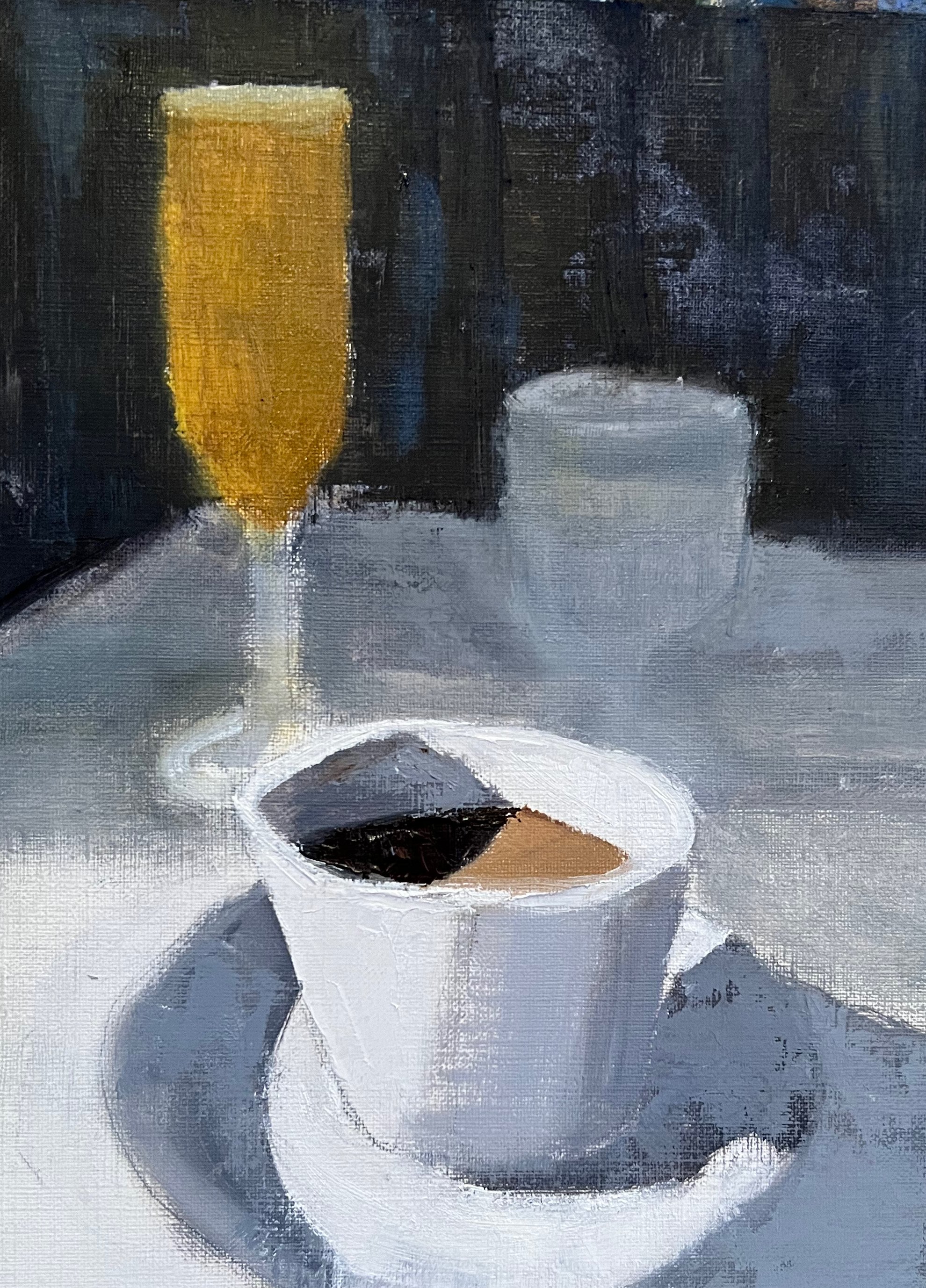
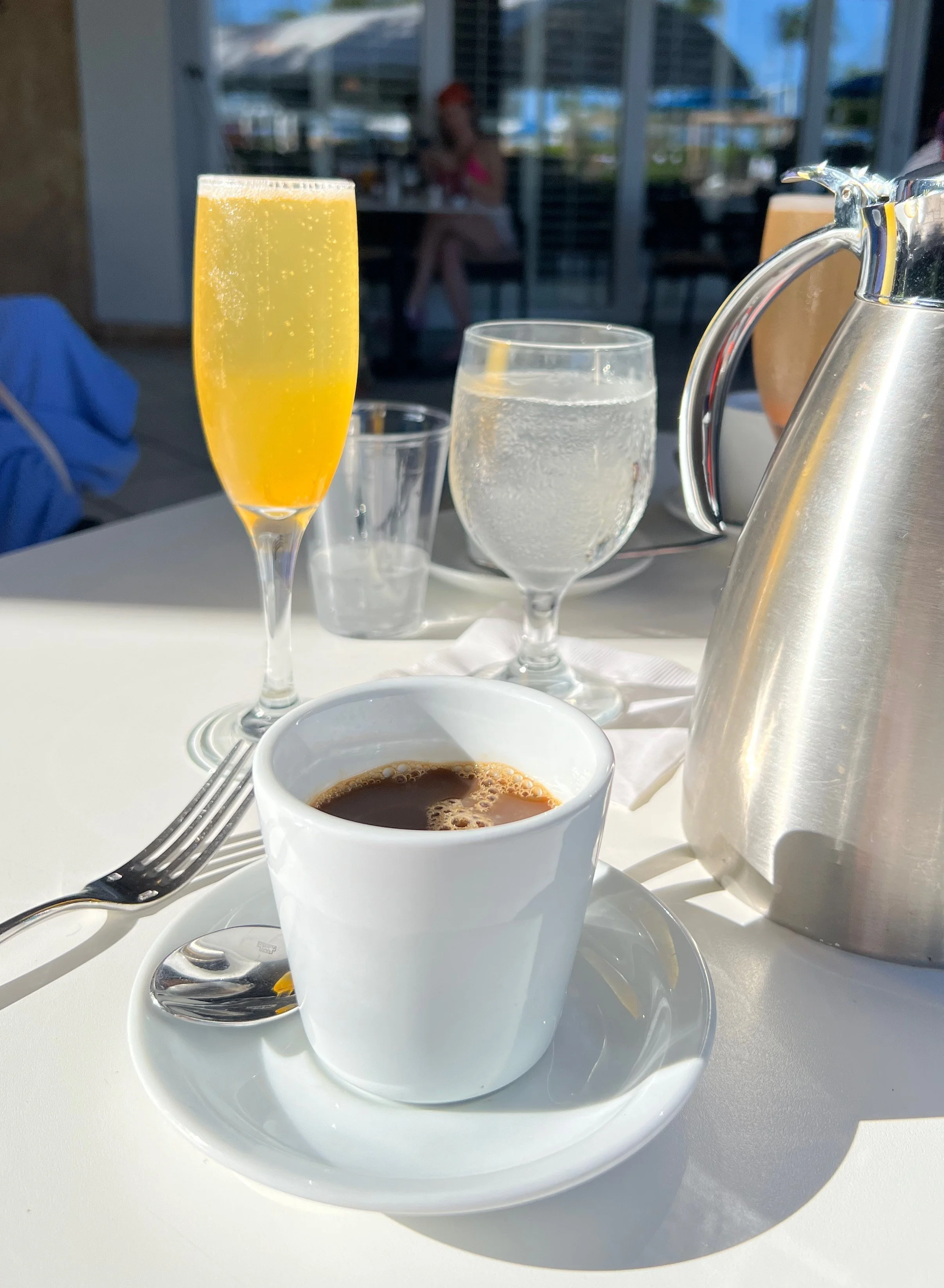
For this quick exercise, I used this image
where the attention was clearly the bright yellow Mimosa.
I challemged myself and made the coffee cup
the focal point instead.
I exaggerated the contrast of the dark coffee
and the bright white cup by
dulling down the Mimosa and the other glass.
I also used thicker paint in that area.
Below was my first pass, but the Mimosa was still too prominant.
So I darkend it and softened it even further!
(See top image)

This is a fun exercise that really helps you think about the
design of the painting, rather than the subject.
Manipulating the elements of line, value, color, shape, edges
to engage the viewer in unexpected ways.
As always, I will be incoporating many of these ideas
in my upcoming Modern Painting class
at North River Arts Society.
Details to be announced soon!