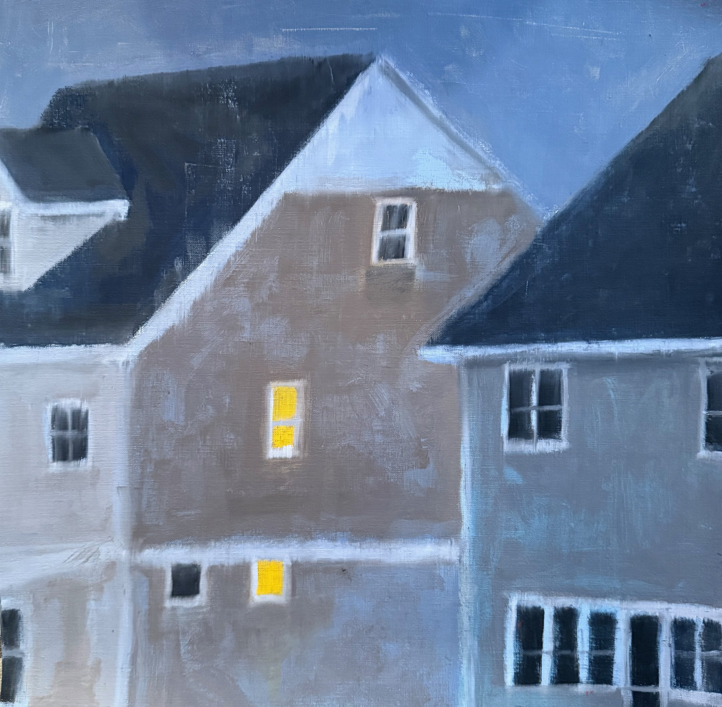
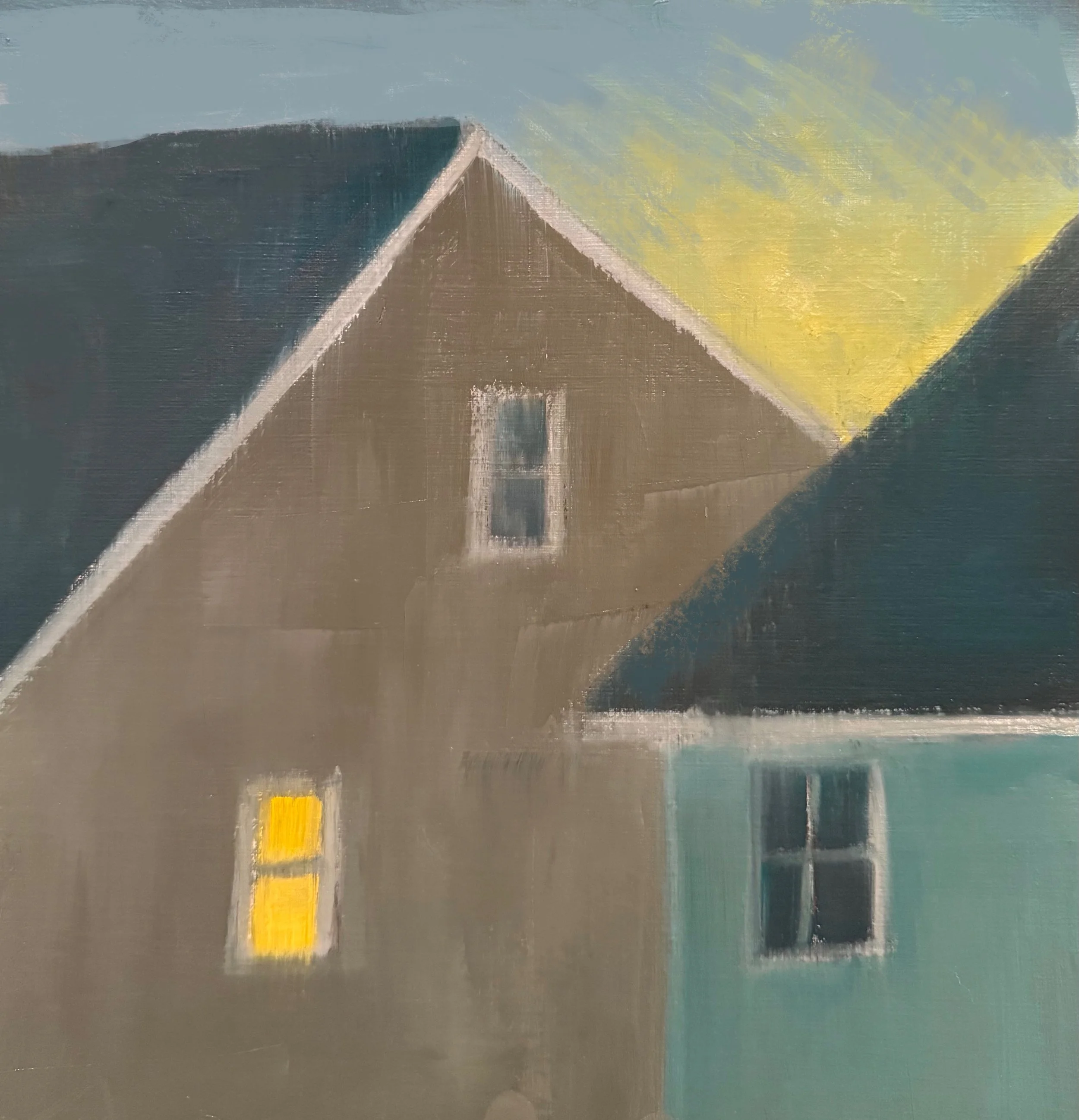
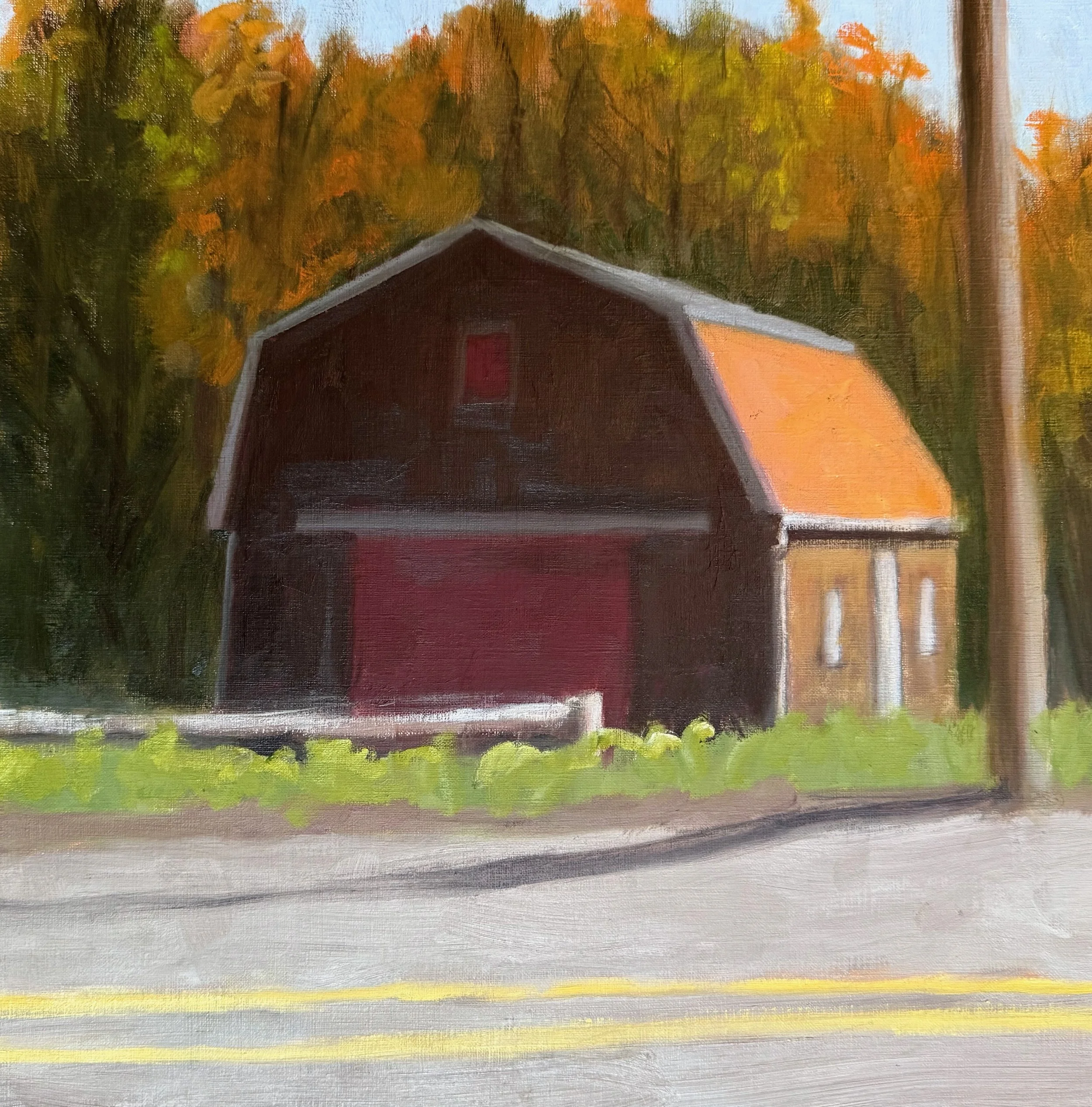
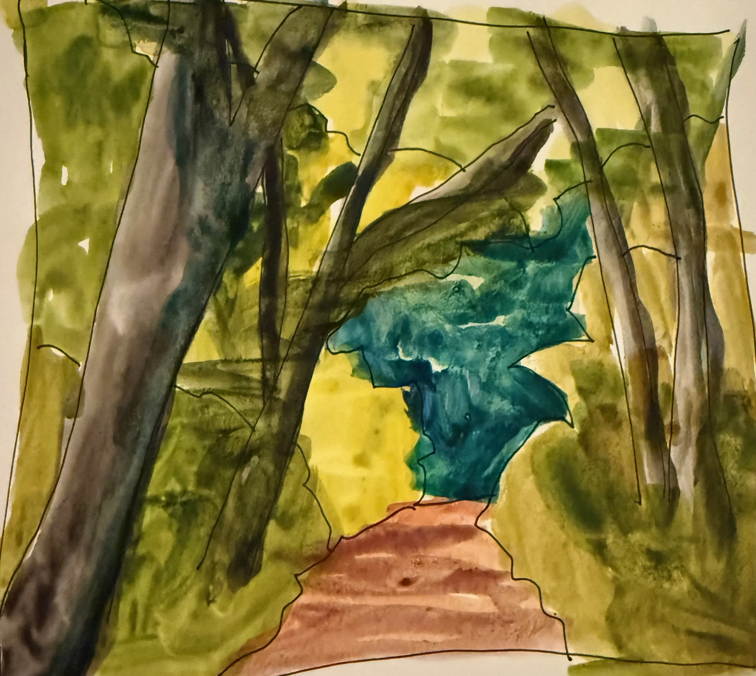
I’ve been “all over the boards” lately in the studio;
exploring new subjects, approaches, and materials.
So I decided to take a “paint application” class with Anne Wolfer at Winslow Art Center
to give me some focus.
It was a great class
and her demos were fascinating.
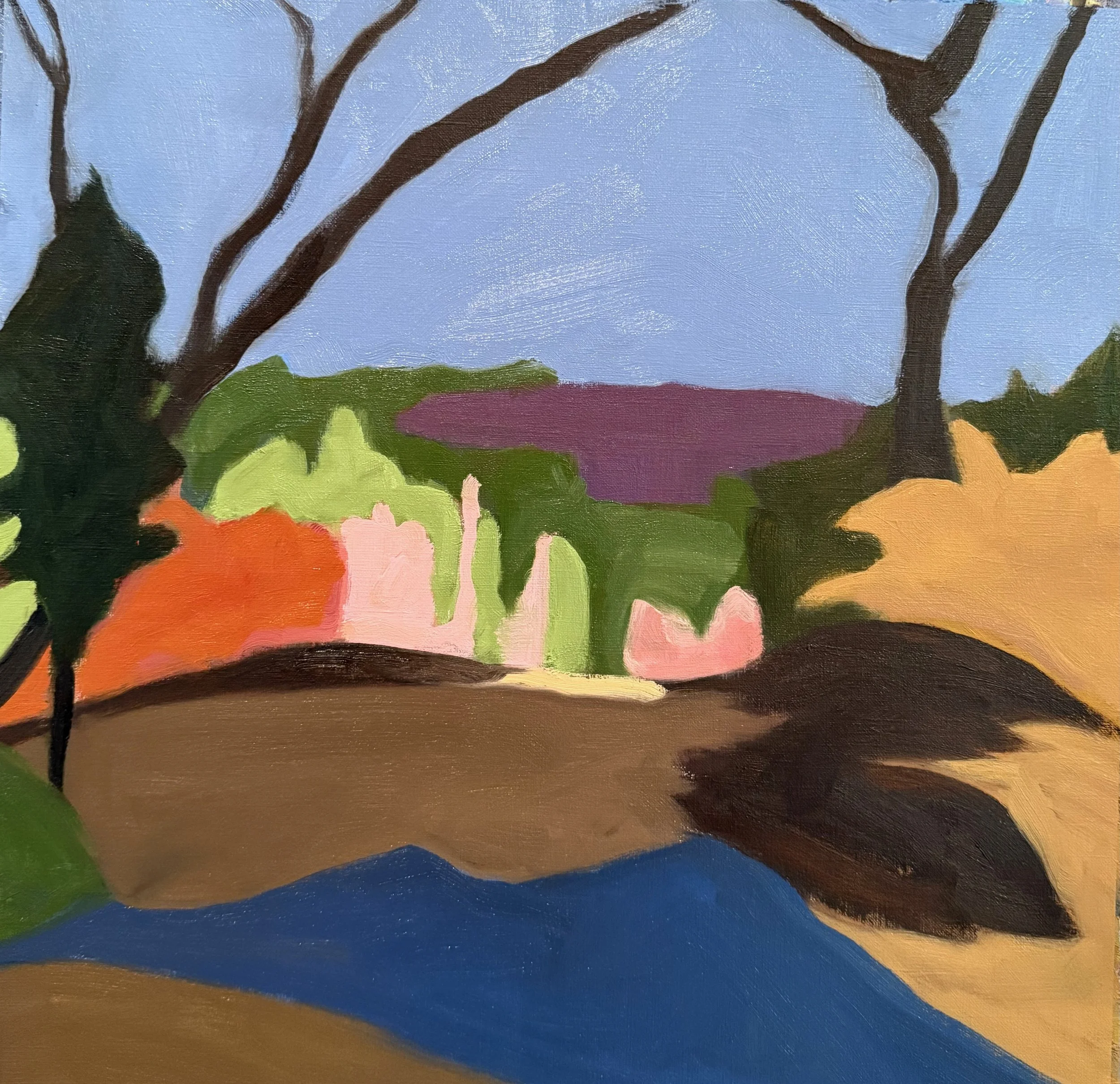
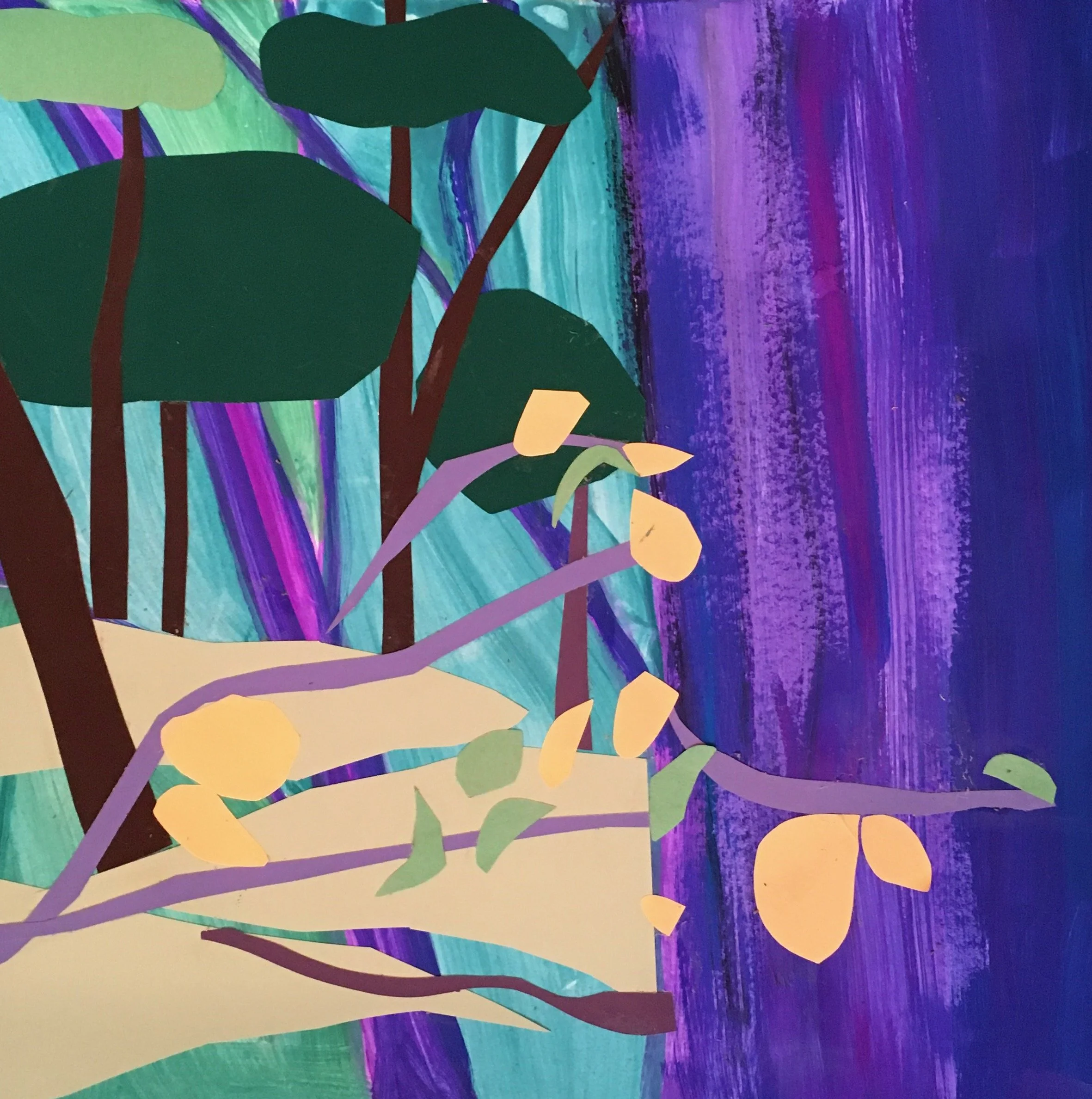
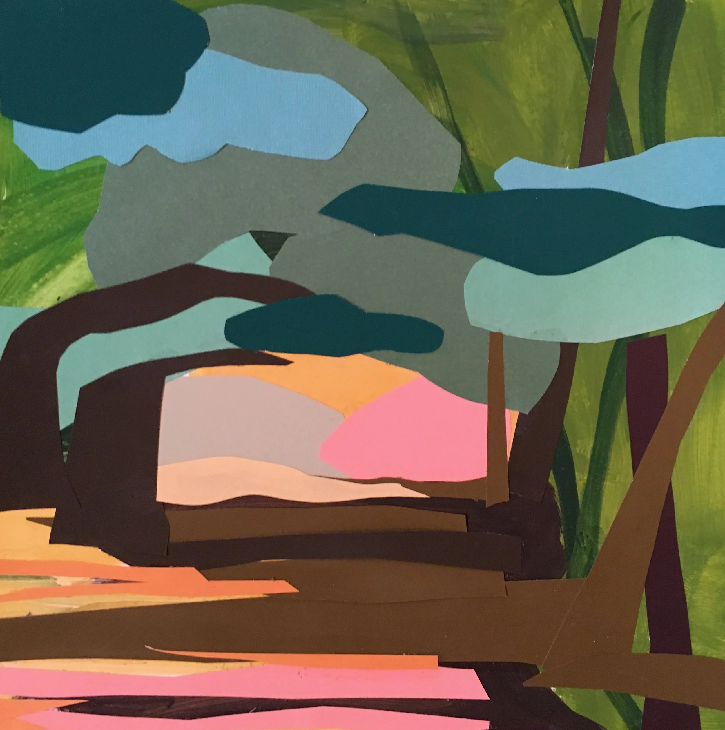
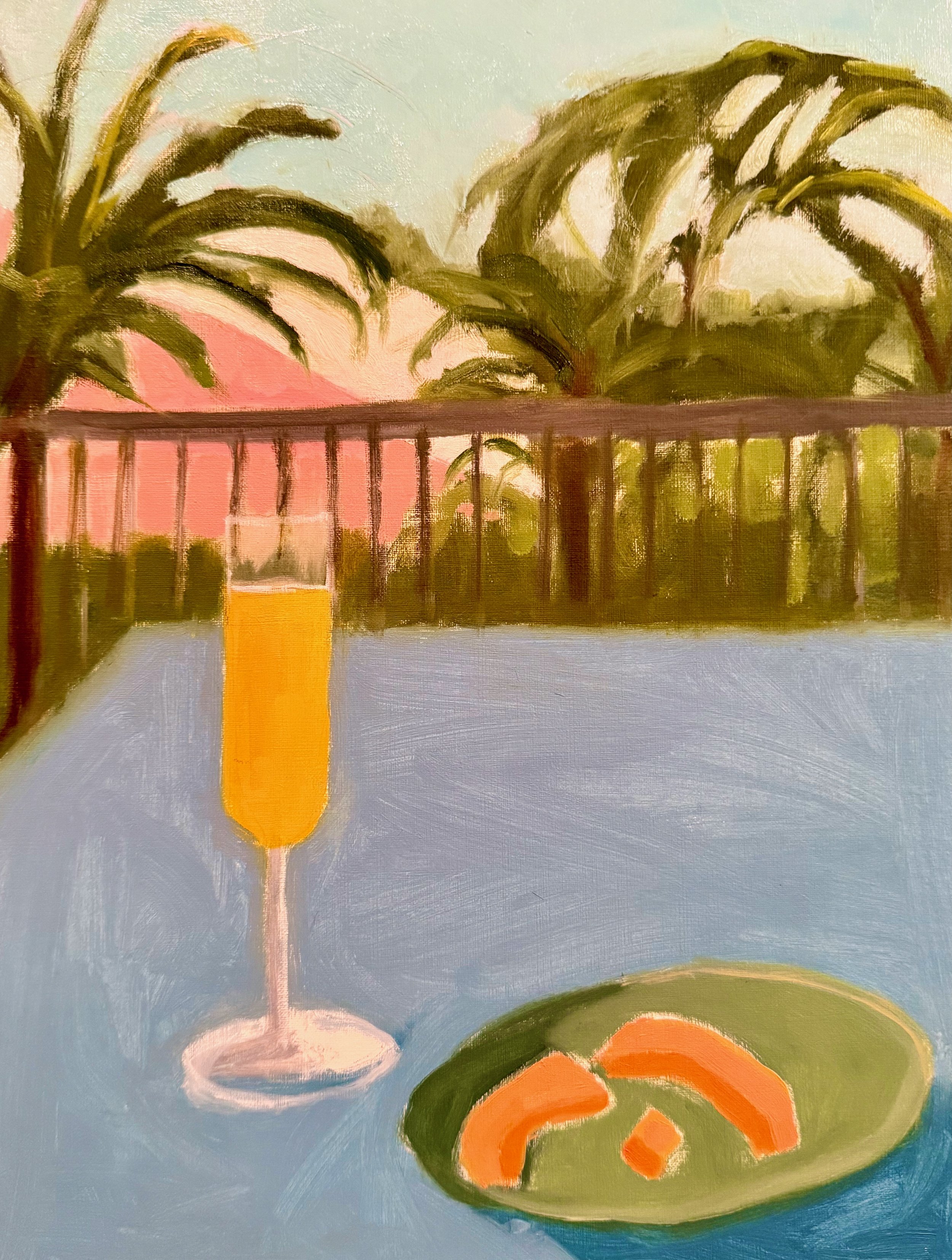
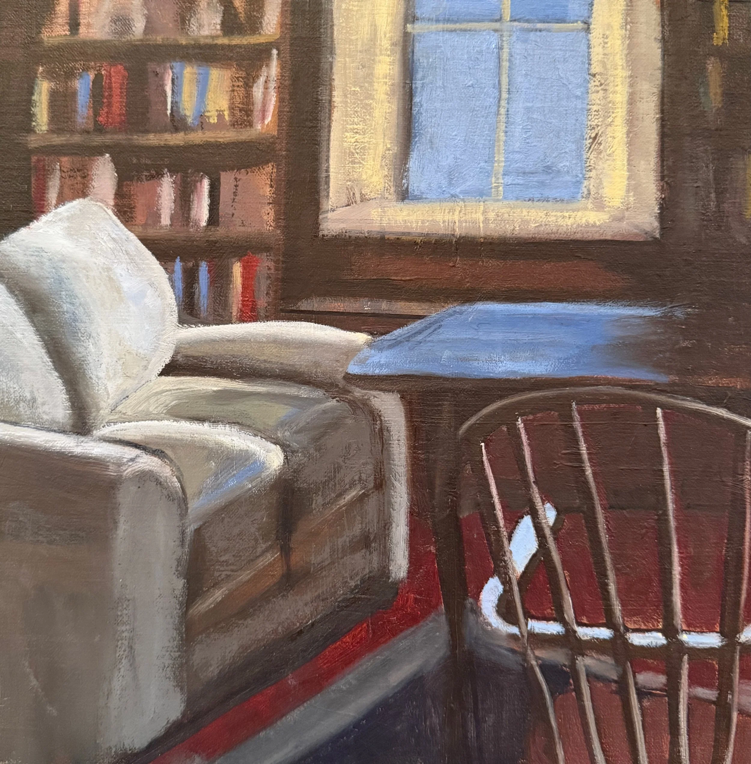
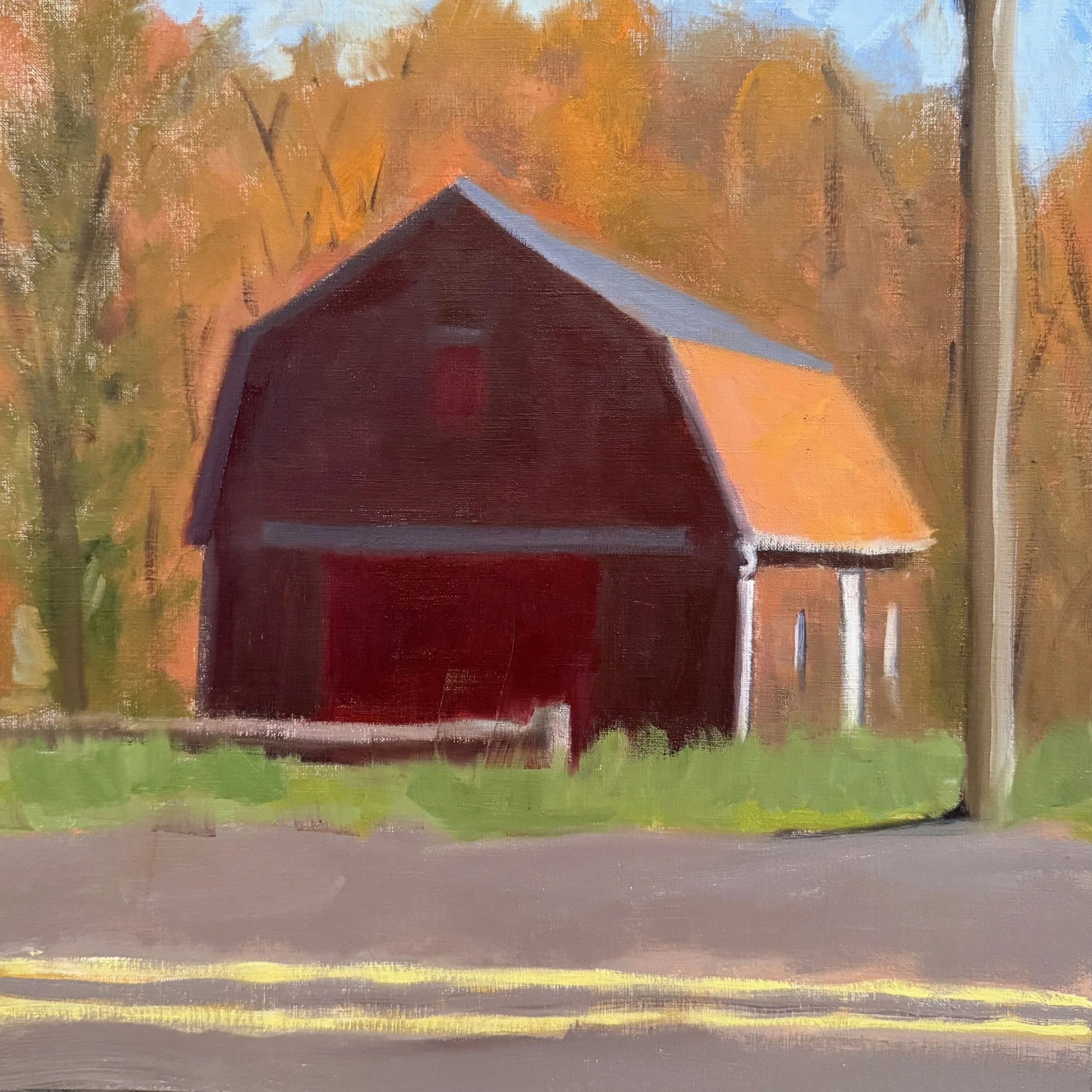
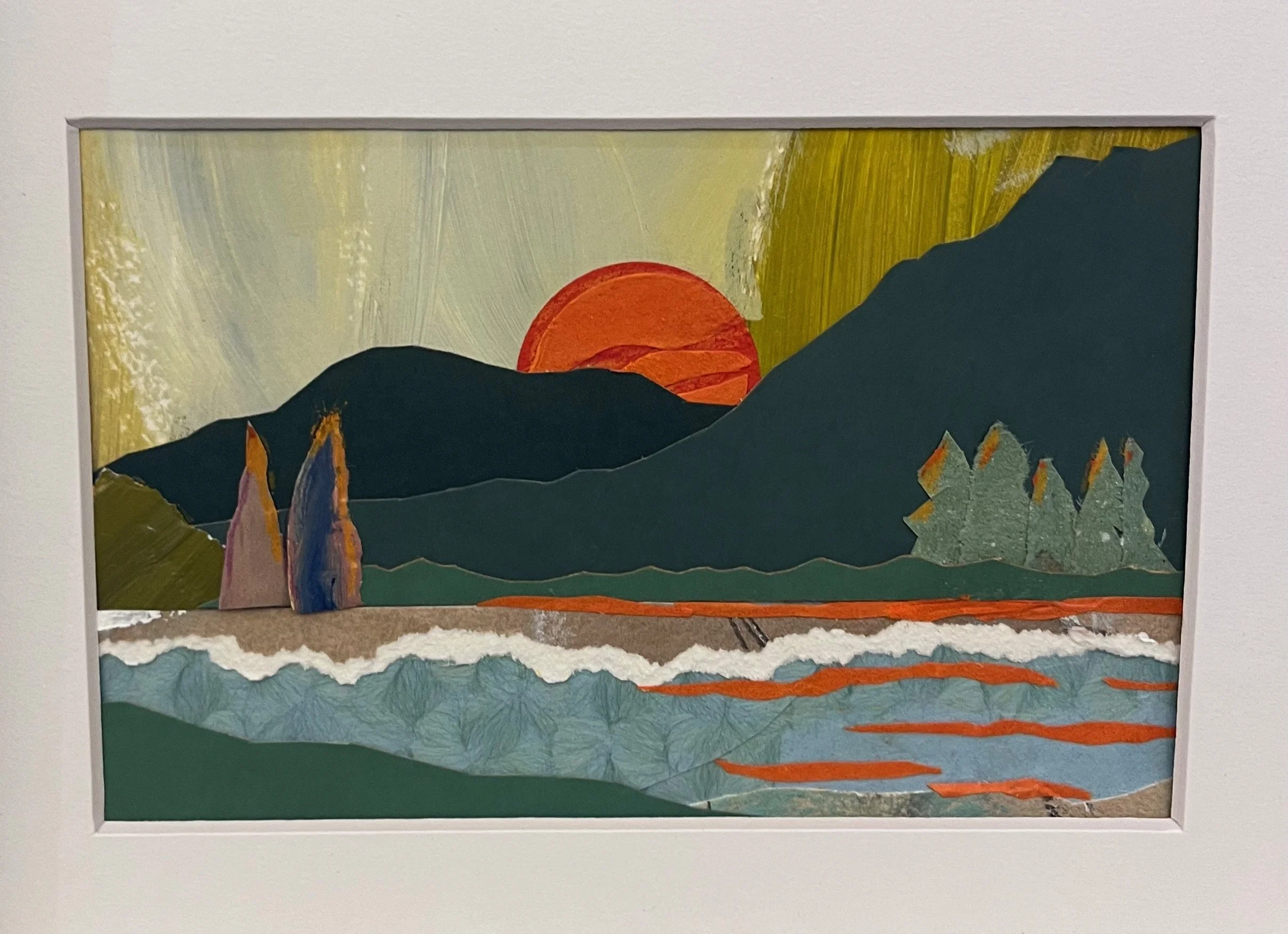
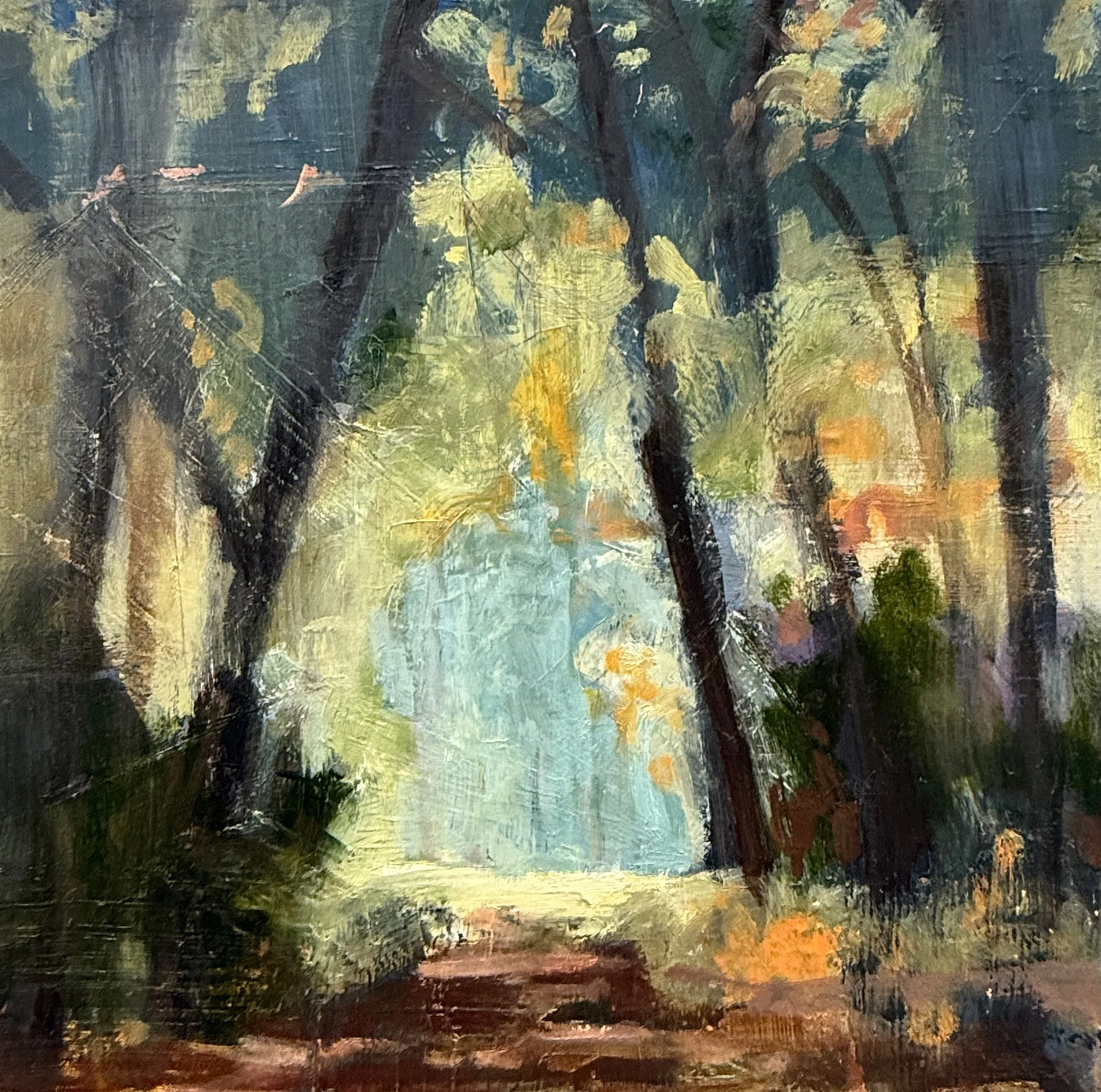
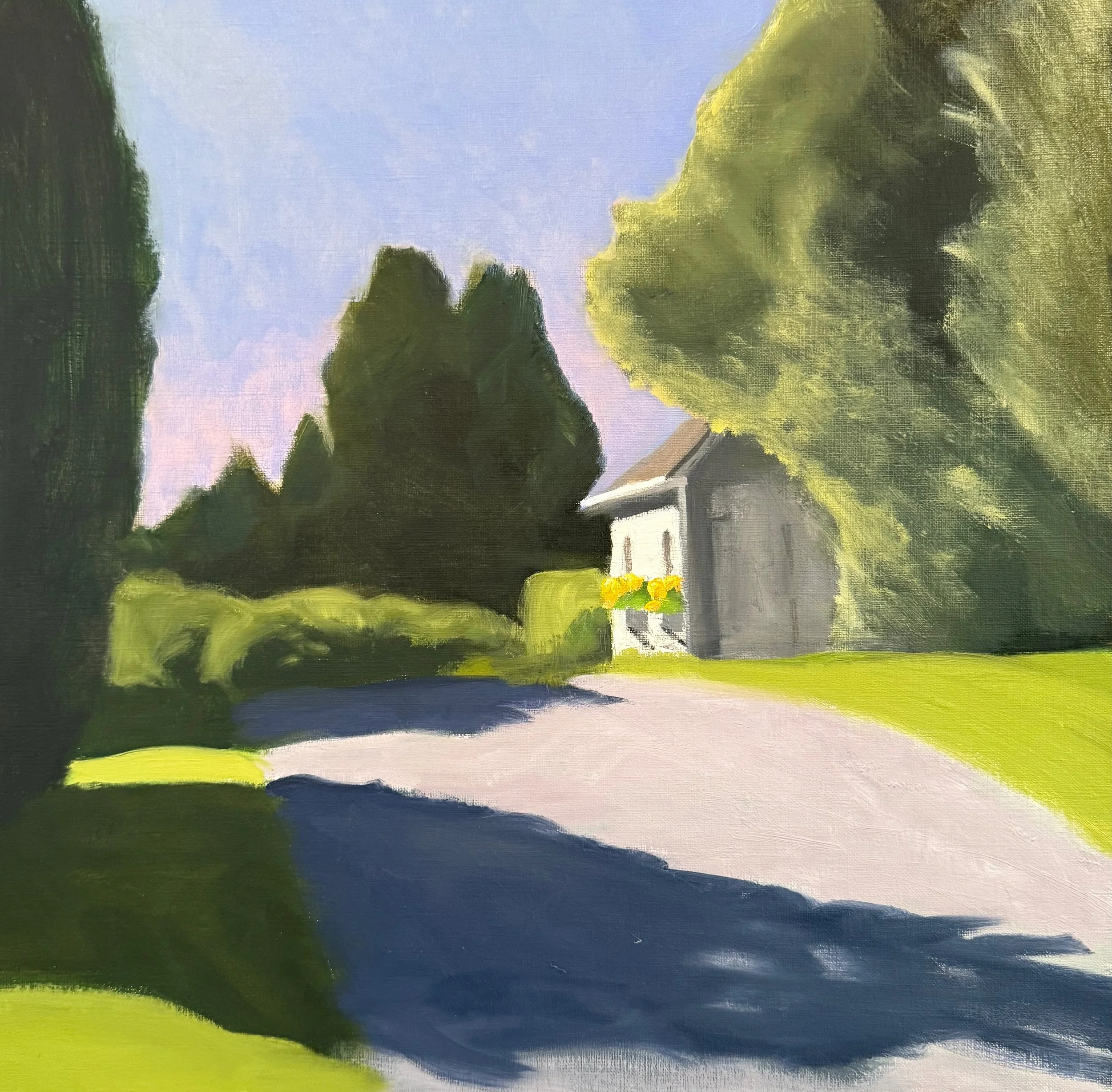
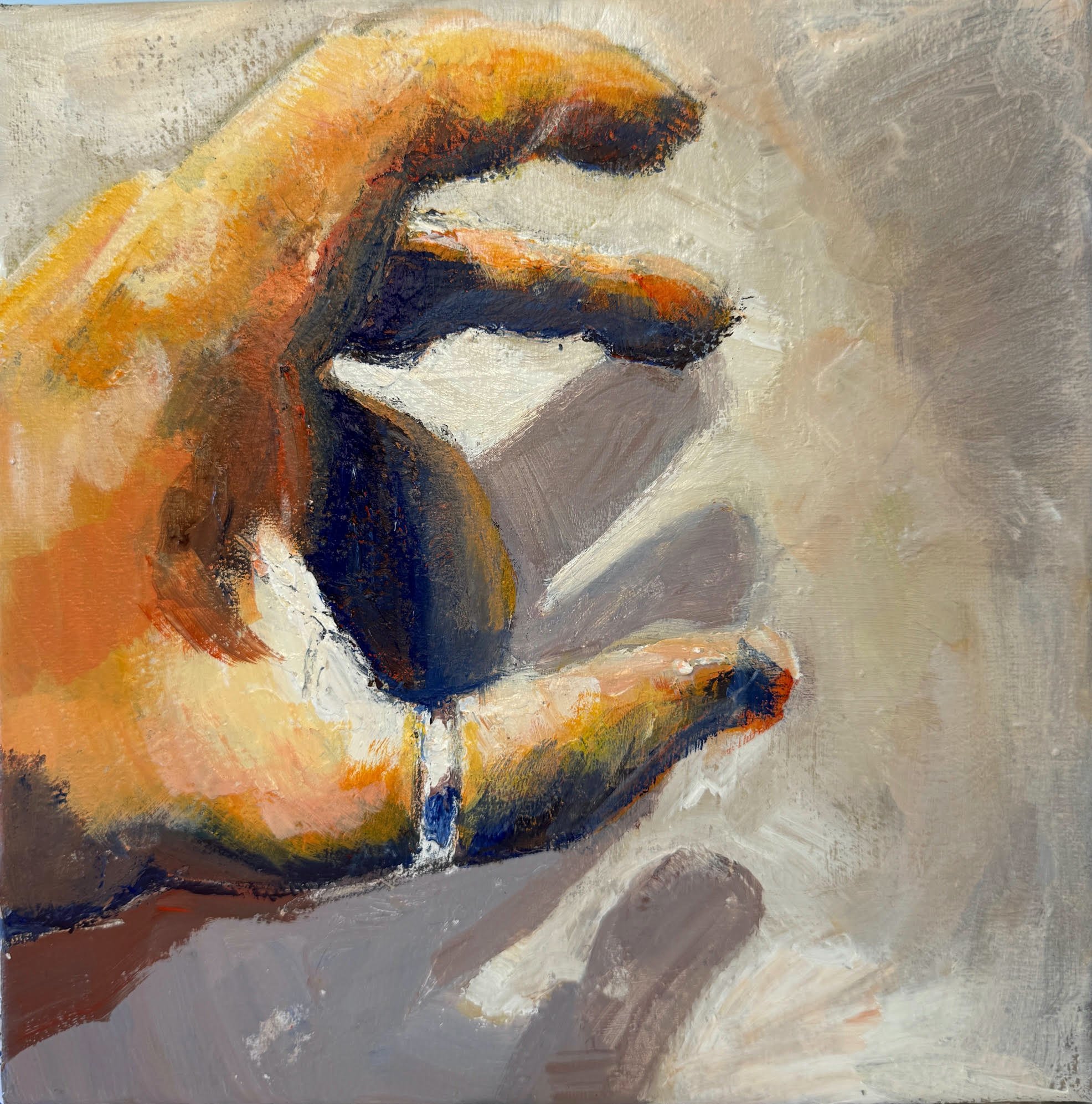
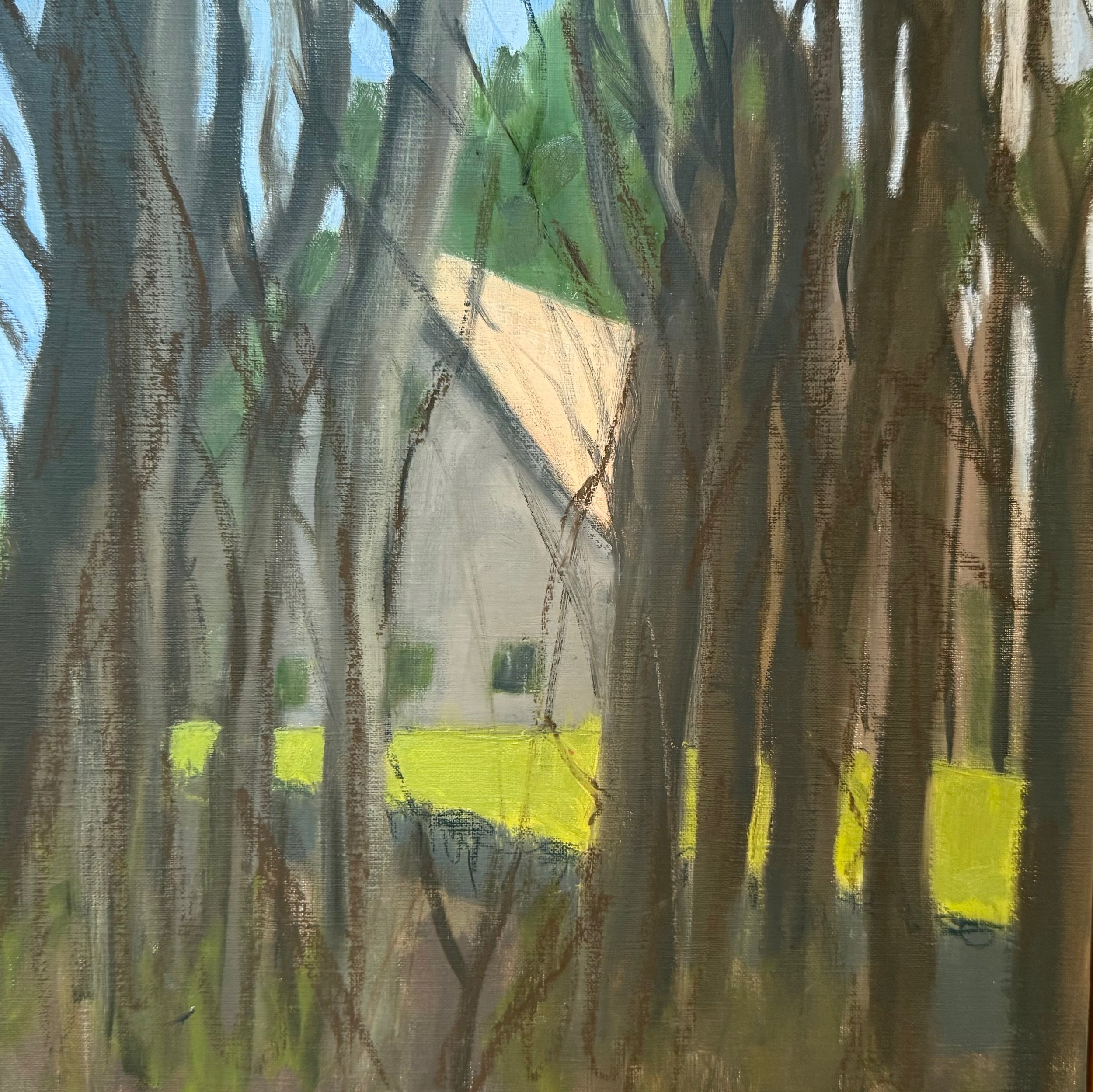
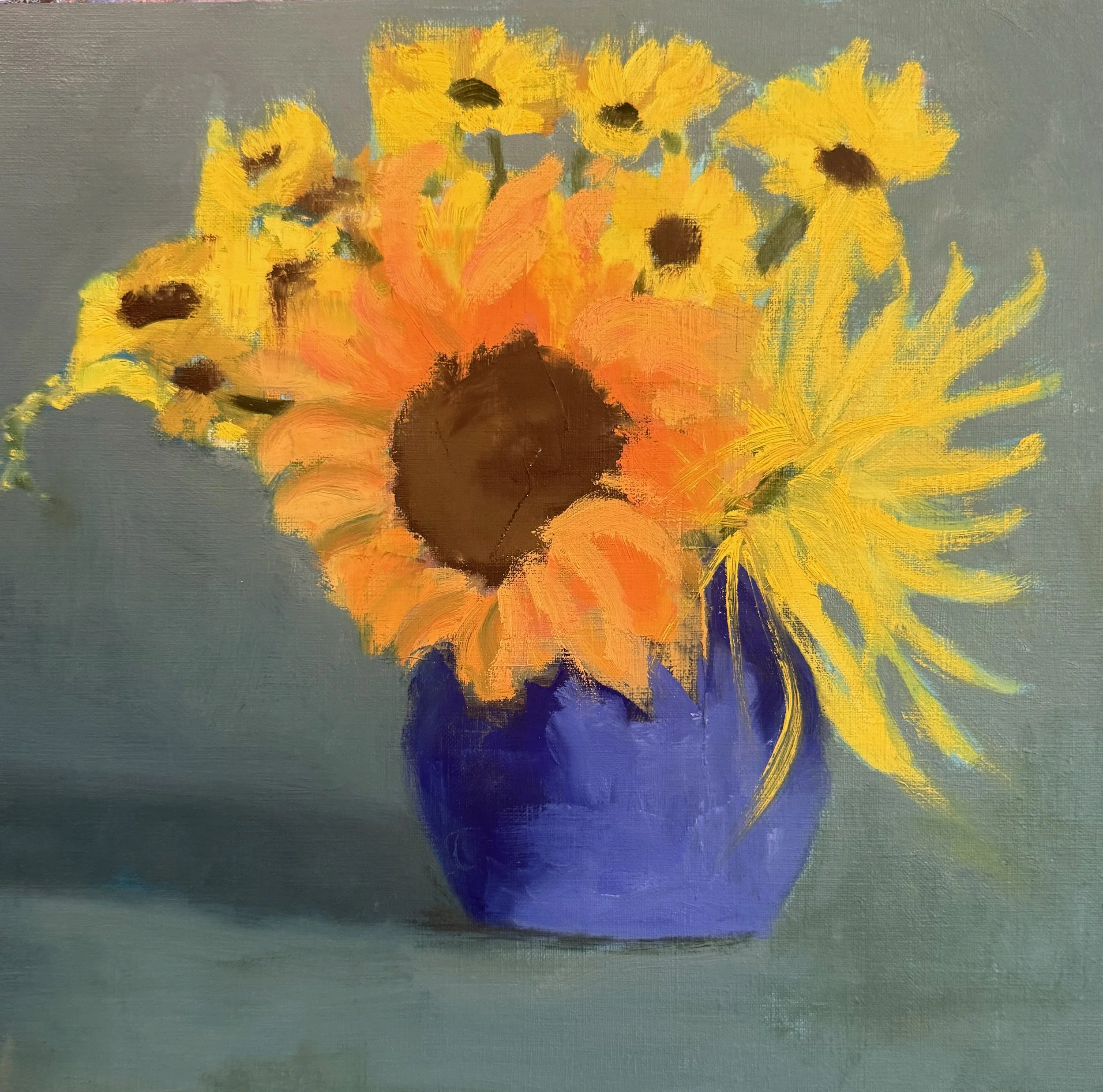
Here is a quick 12 x 12 still life I did.
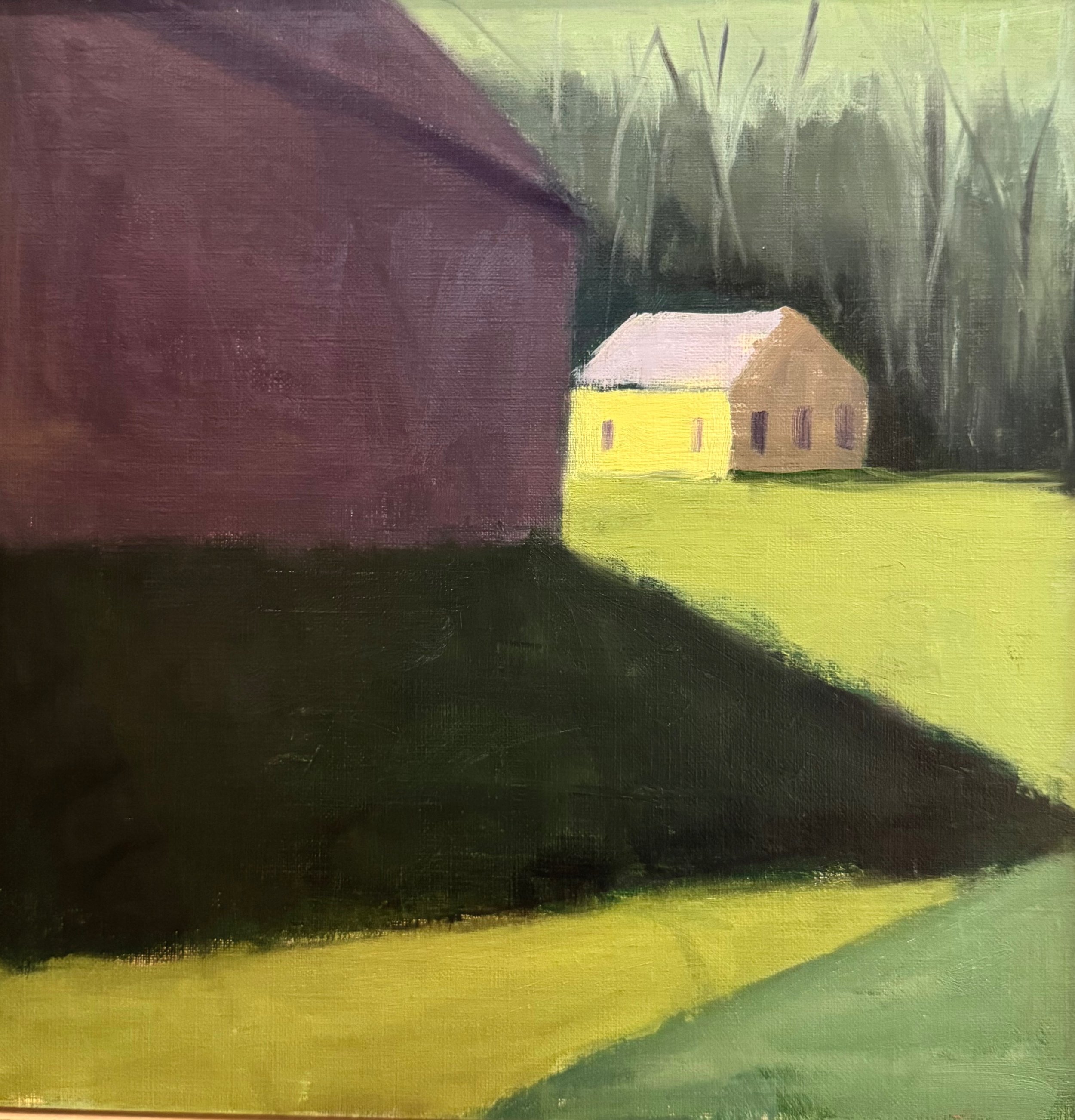
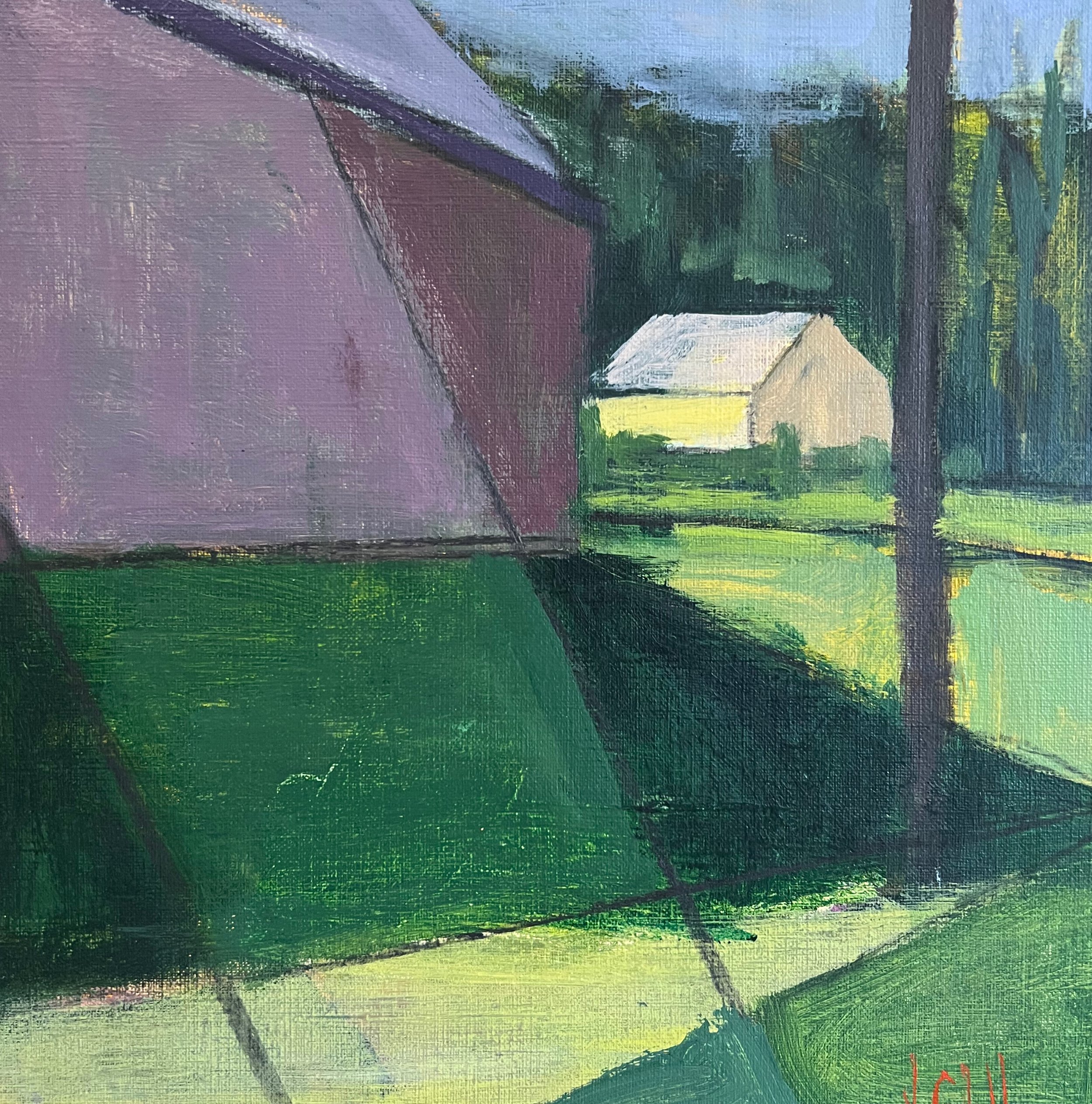
Paint application is very personal and
difficult to teach.
And yet, it is one of the most important
aspects of expression in painting.
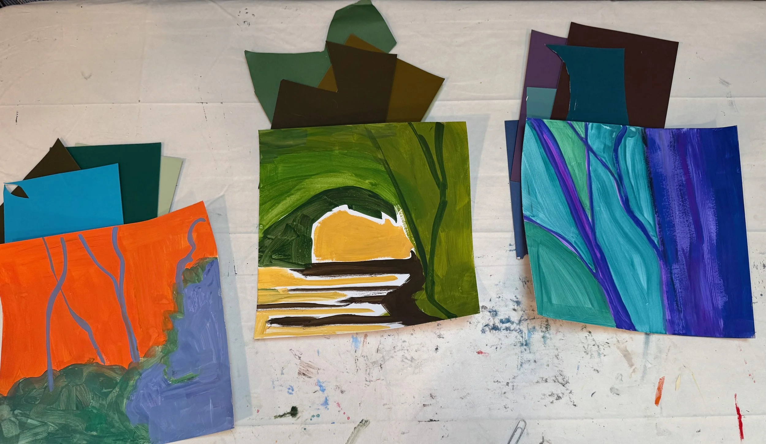
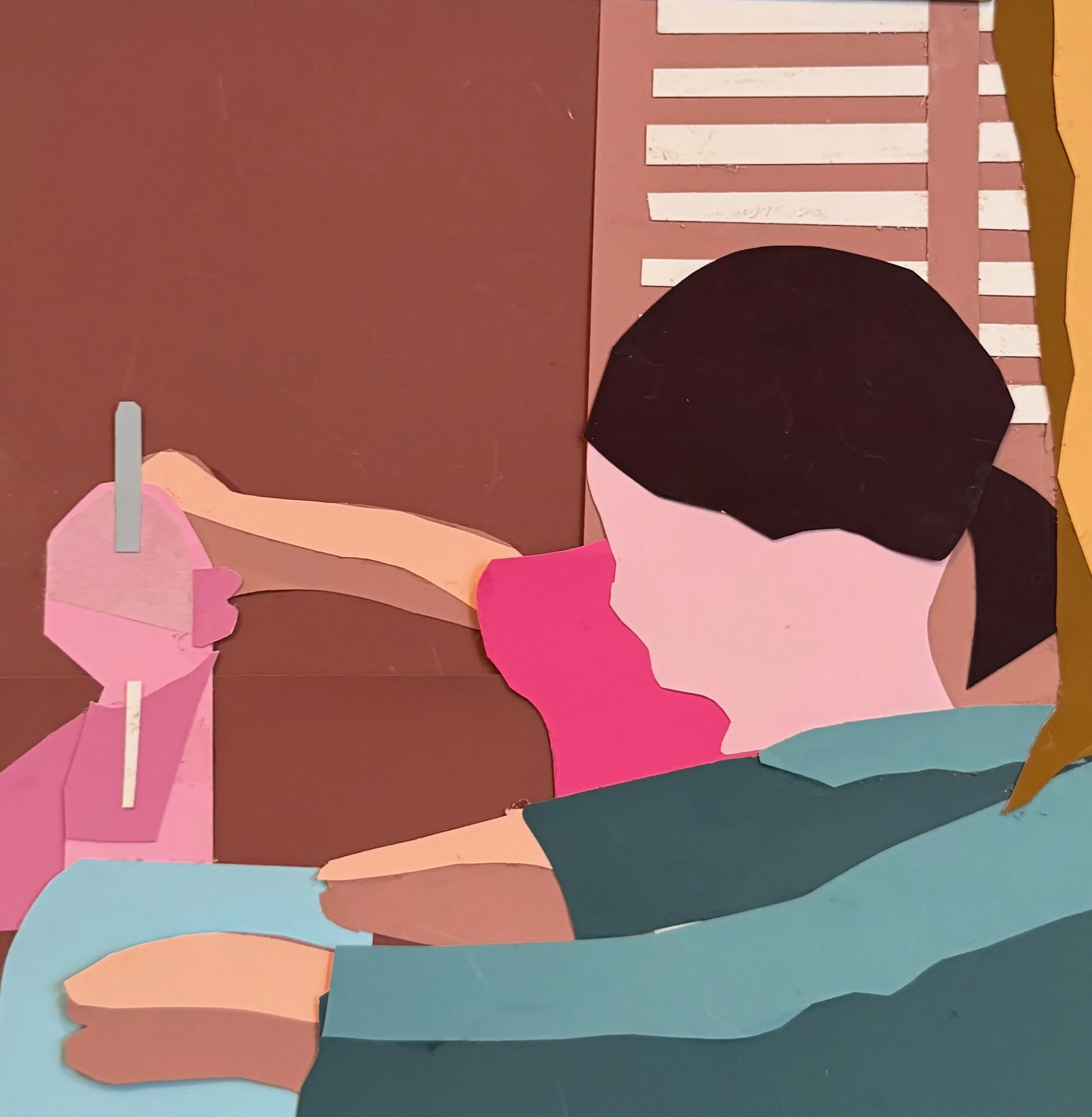
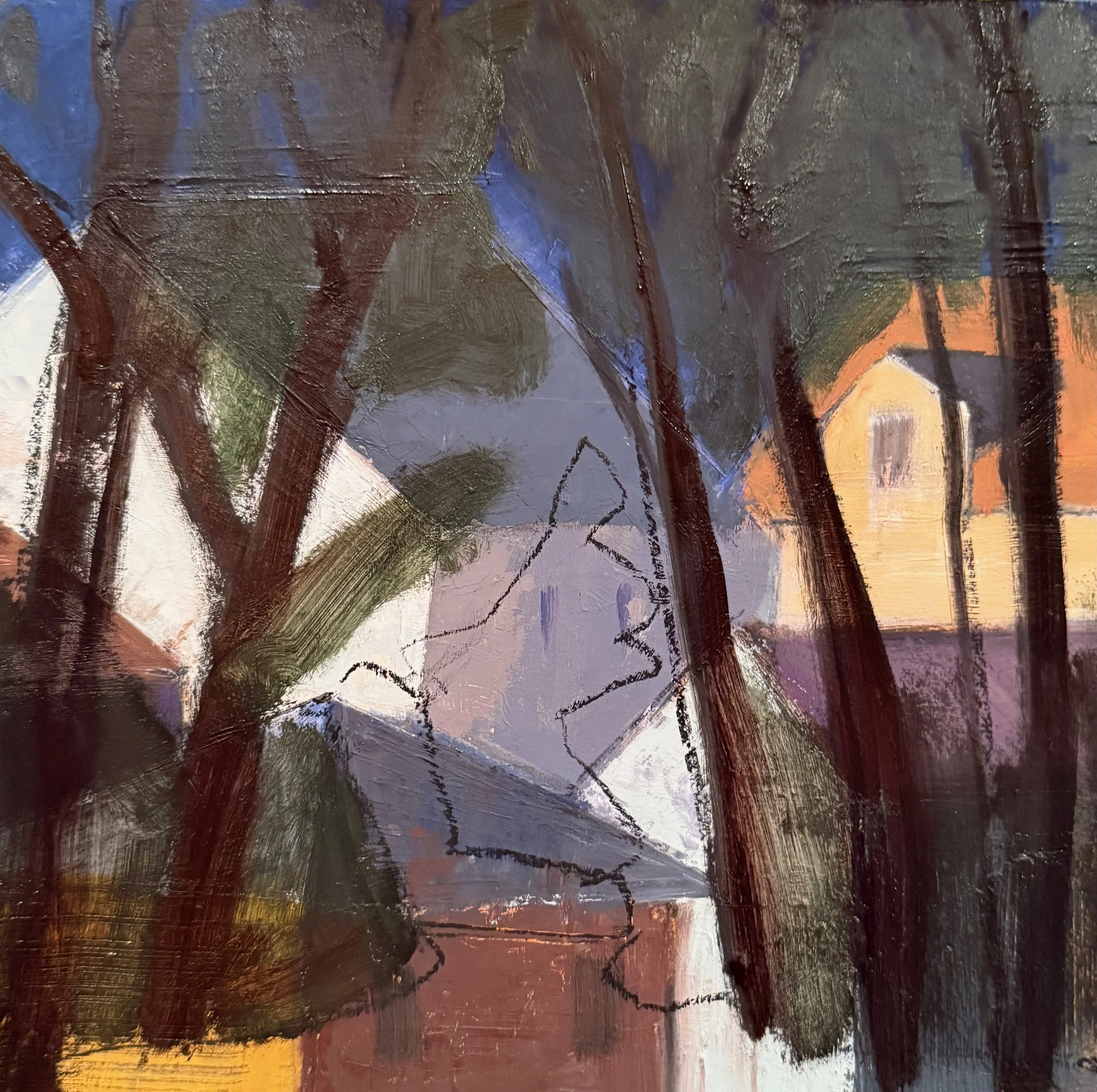
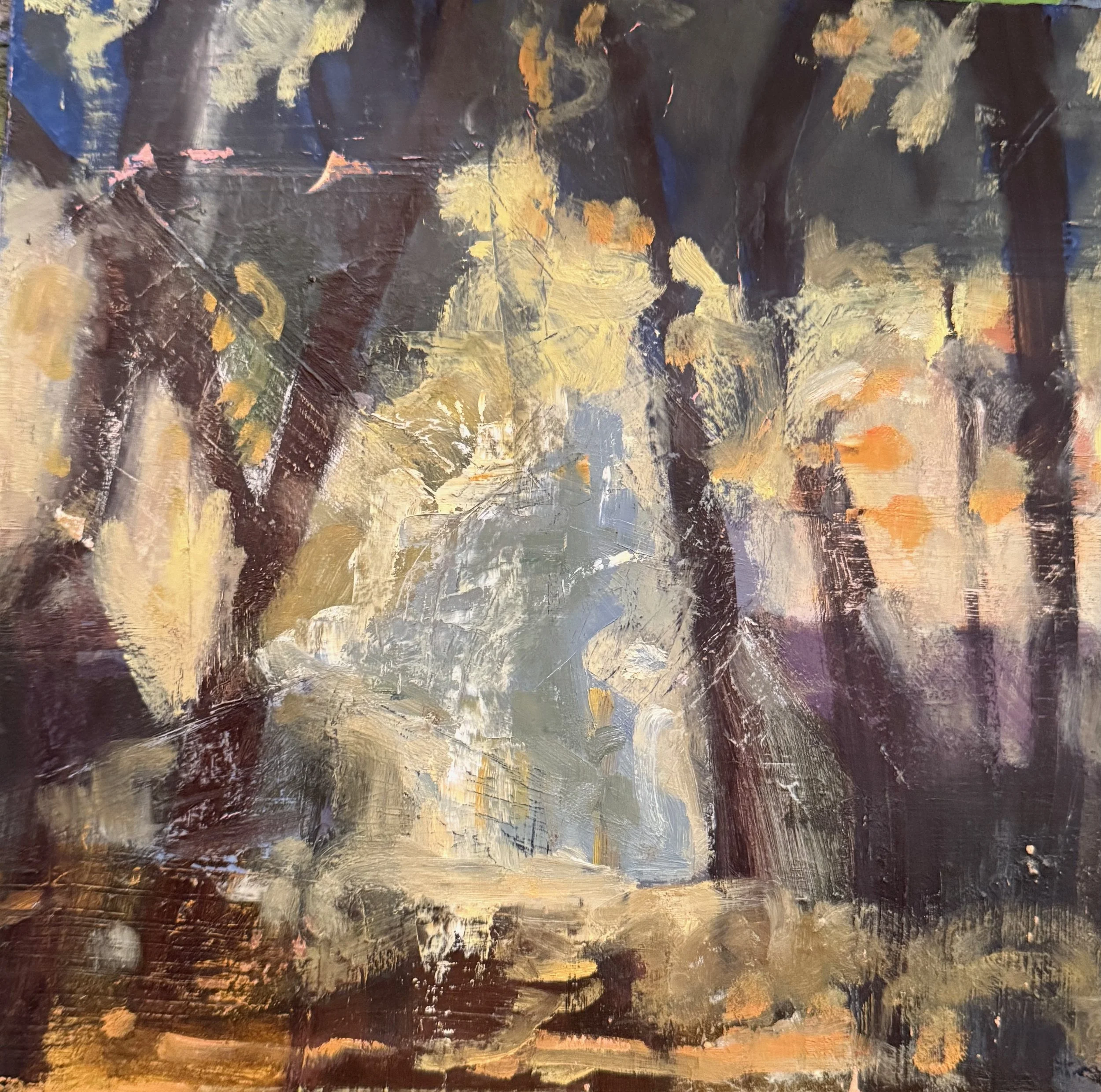
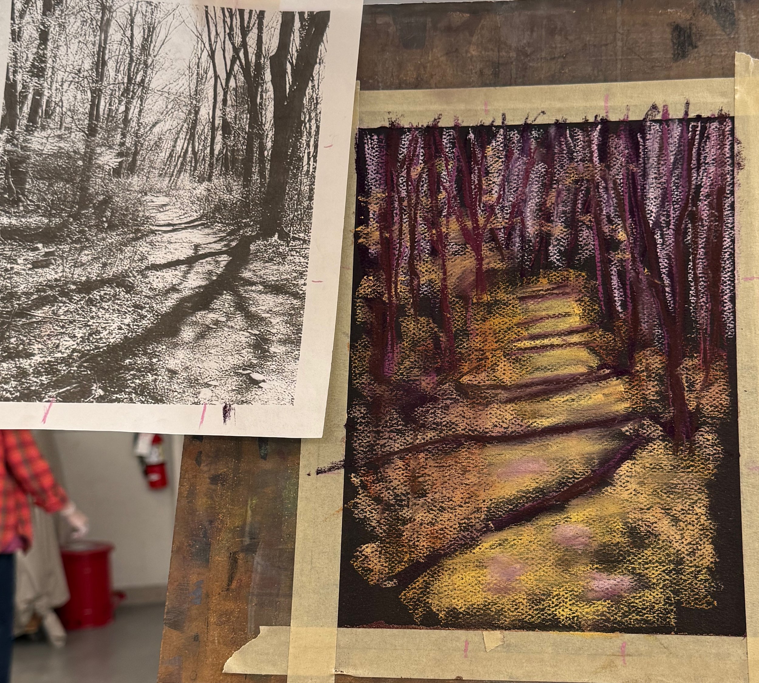
I discovered the concept of “disruption.”
(I call it “destruction”)
with Tracy Everly a few years ago.
The concept of disrupting the surface has fascinated me ever since.
I highly recommend taking online classes at
Winslow Art Center!