This week in Modern Painting we did an exercise using
a limited pallet to create color harmony.
Using a black and white image as a reference
we chose either:
-complementary/analogous colors
-one dominant color family
or
-mostly neutrals with splashes of color.
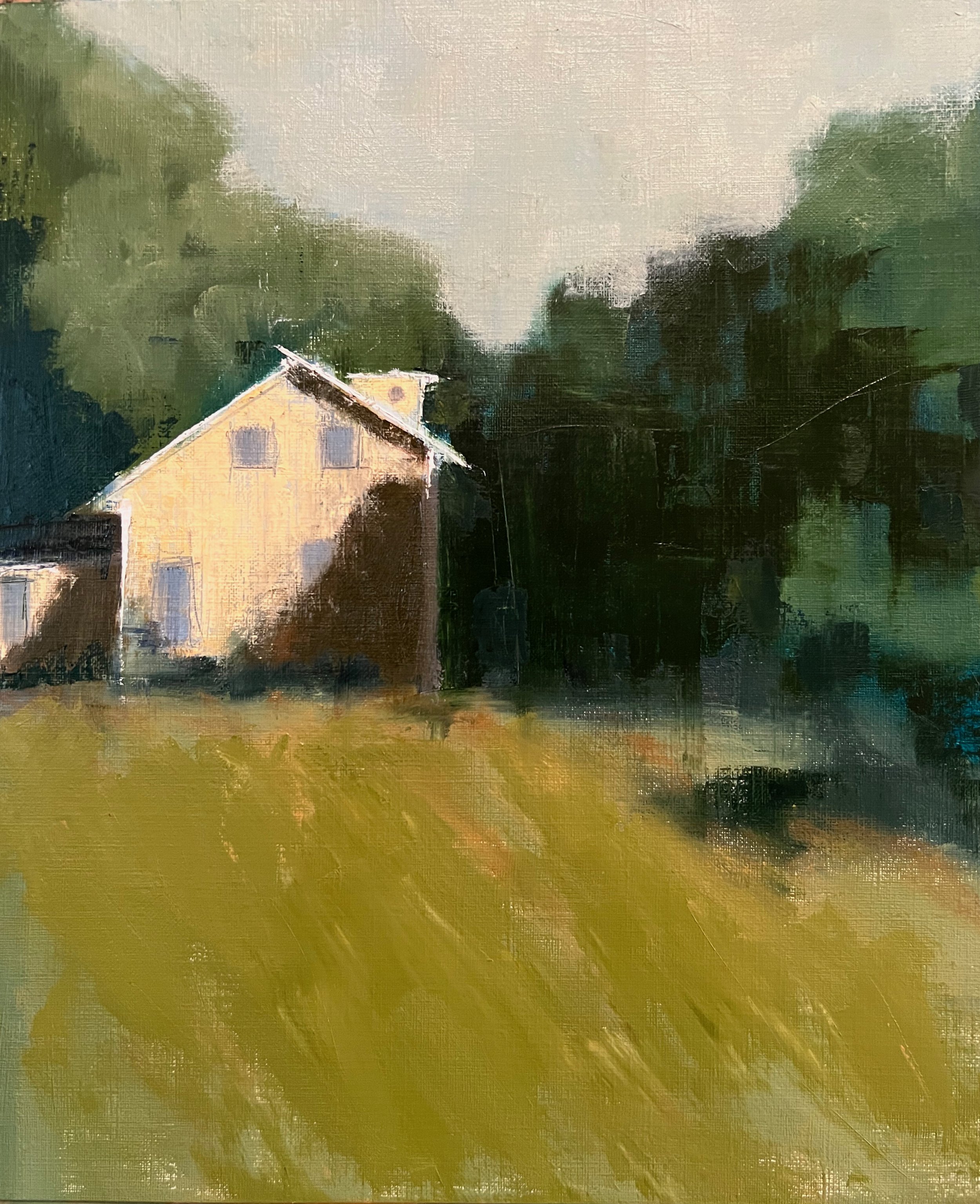
I did this using predominantly greens and blues
(analogous) and a titch of cad orange (complement).
When doing this for a demo, I intitially wanted the house to be blue-ish;
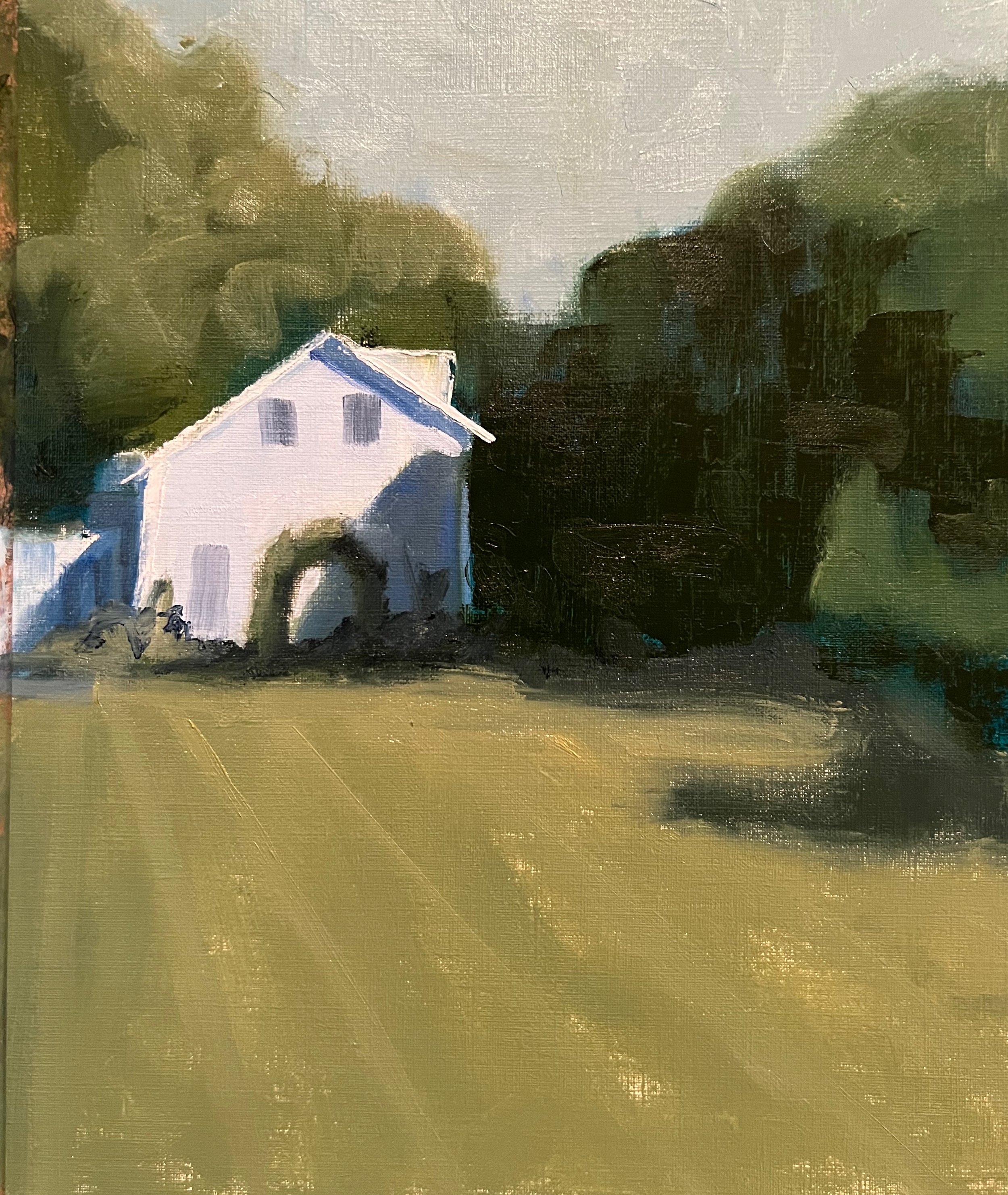
but there wasn’t enough contrast.
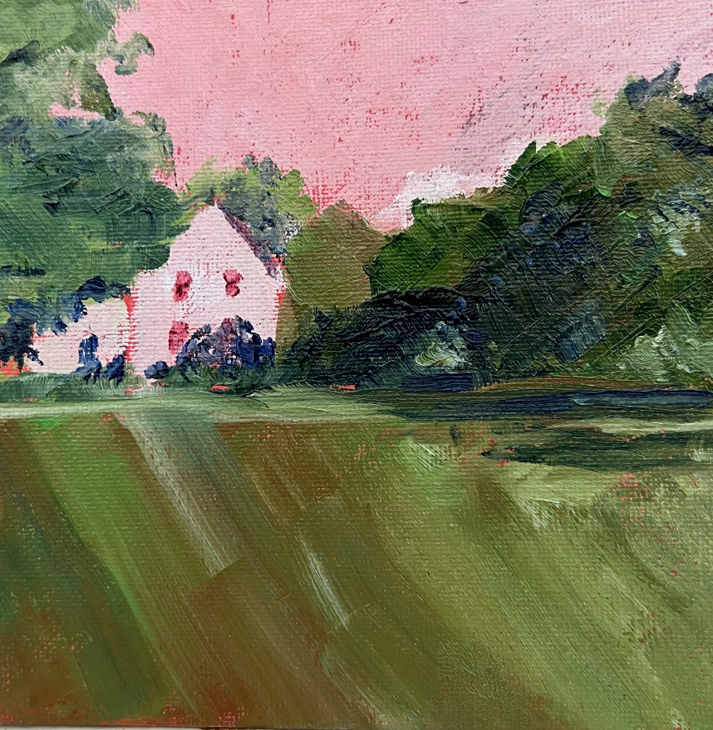
Then one of the students used the same reference
and painted this red/ green complementary combination
Now this really pops!
So that’s when I changed the house to orange,
and I think it works much better.
(I am continually amazed by how much I learn from my “students”)