Designing with three values


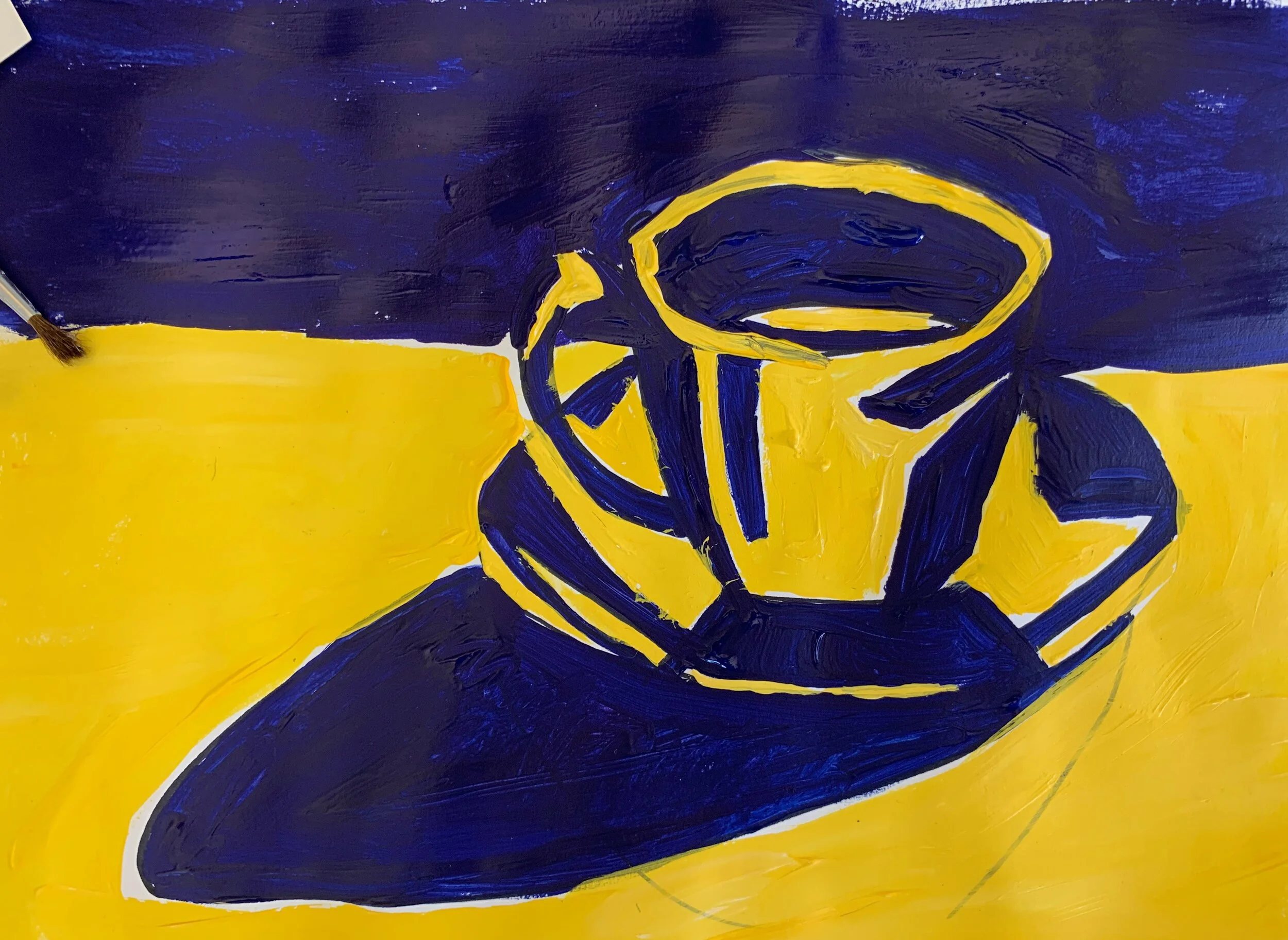
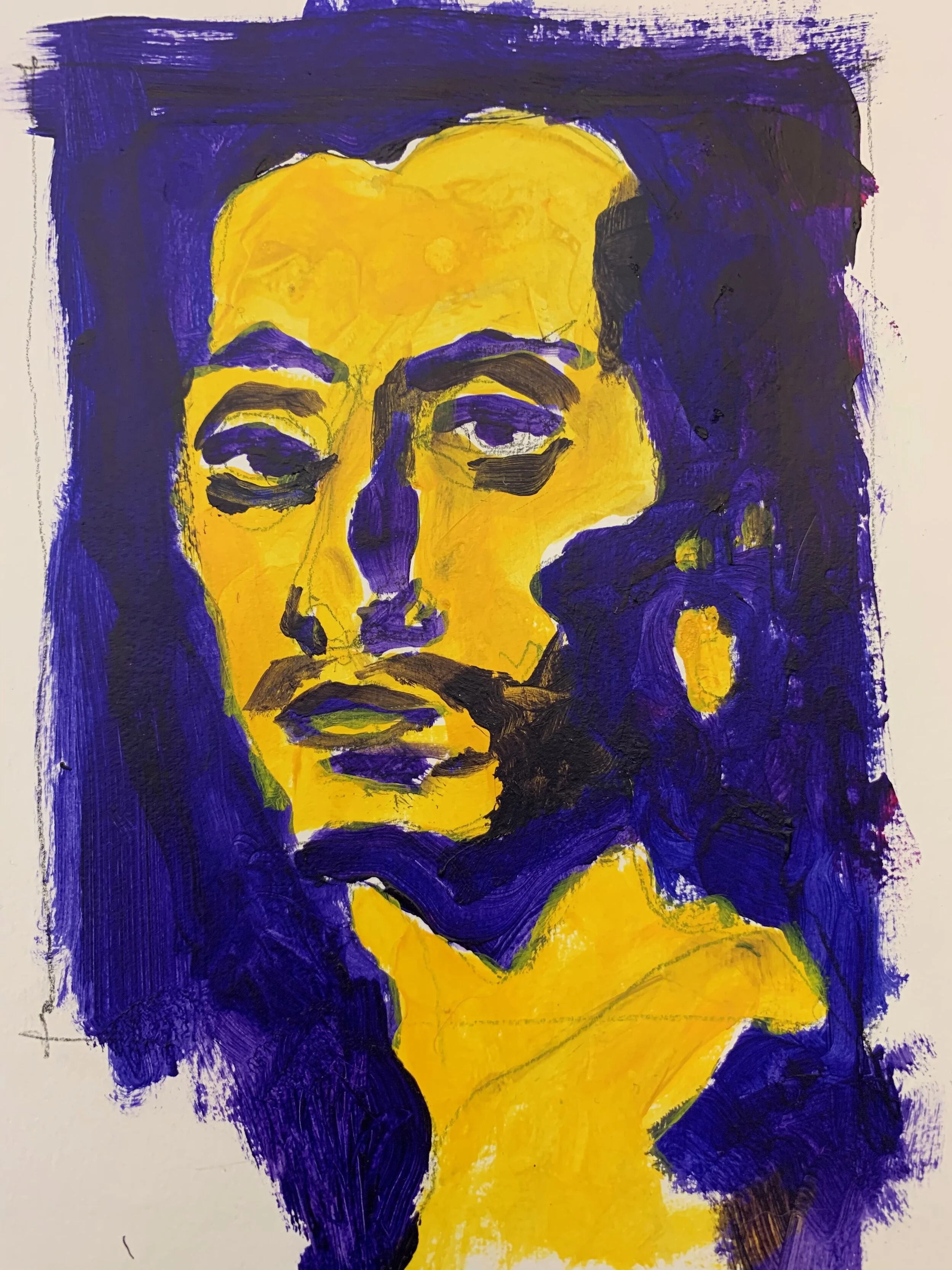
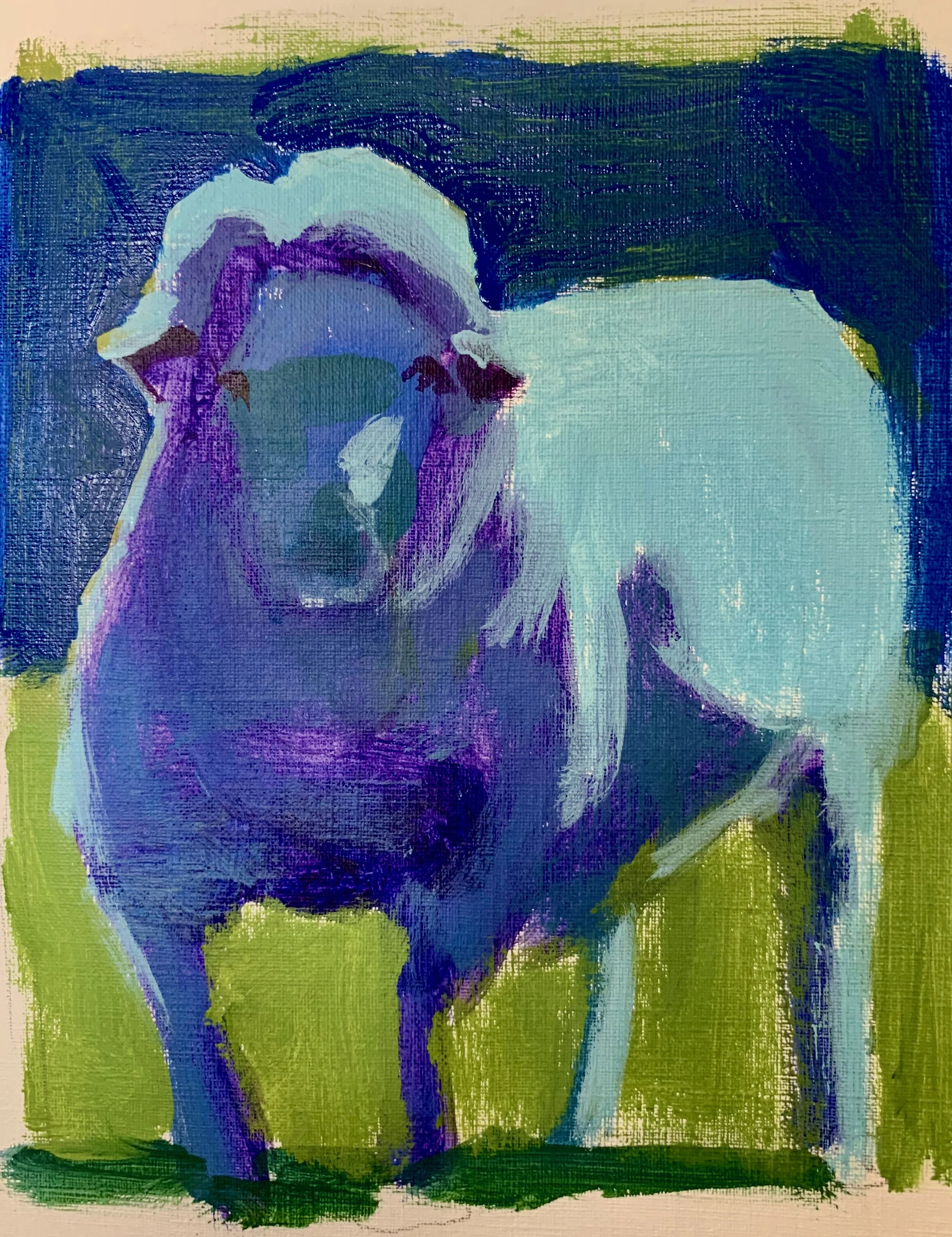
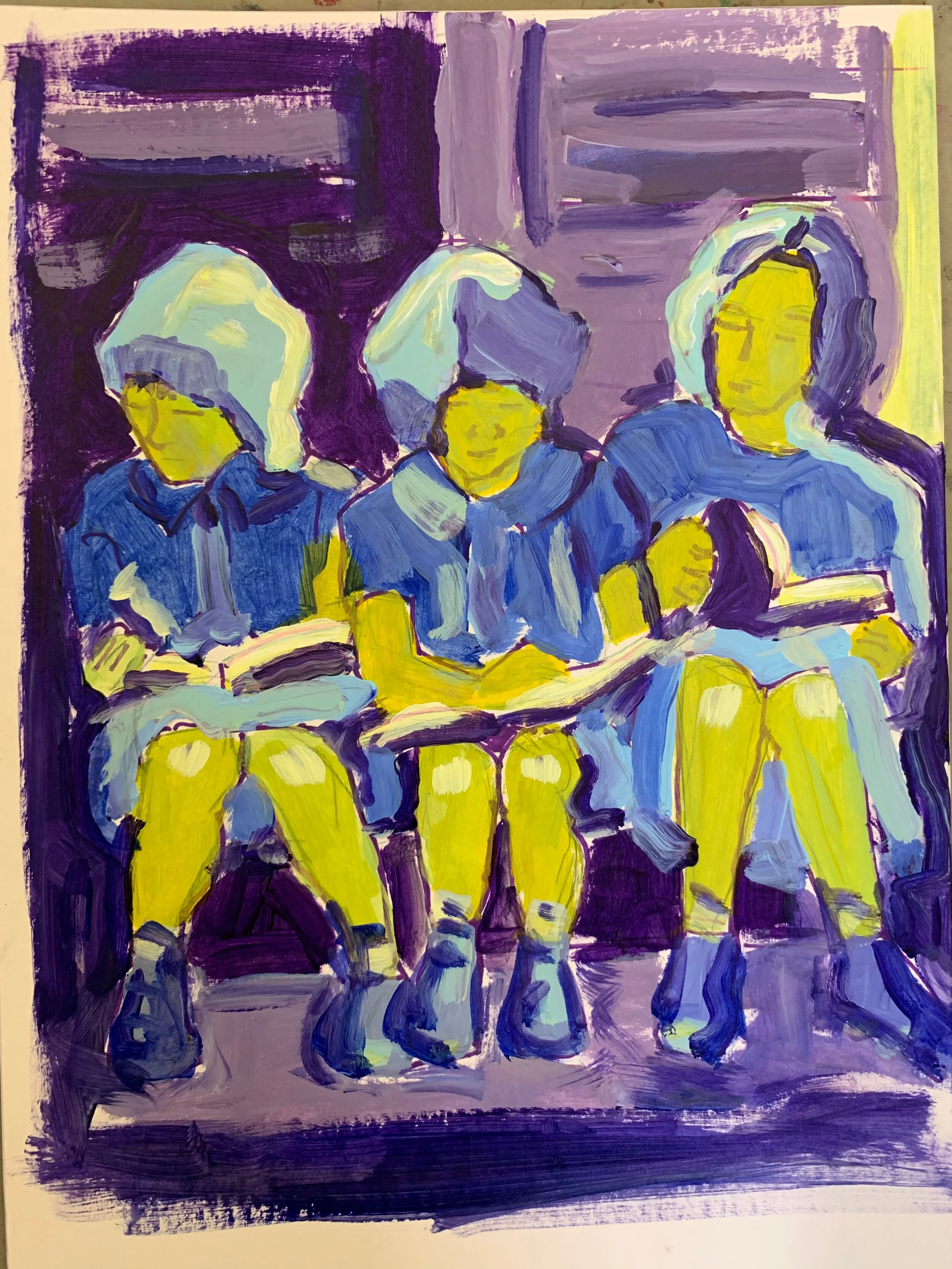
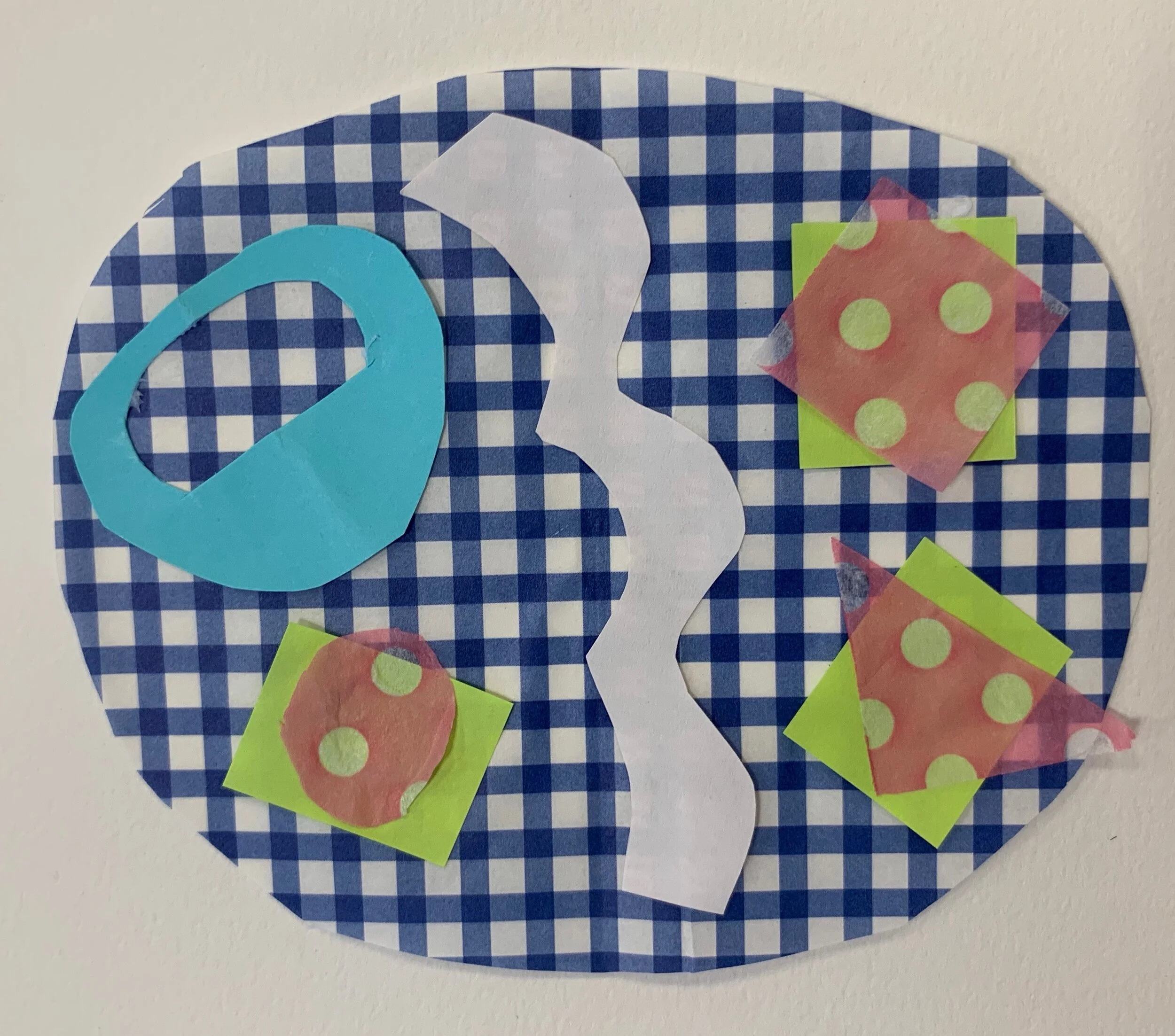
We continued to explore the idea of
designing with three values in class this week.
To me, understanding and manipulating values
is the most important element of good design.
Using just three values is more difficult than you would think,
and everyone approached this in their own way.
Here a just a few samples of class work:

IMG_4276.jpeg

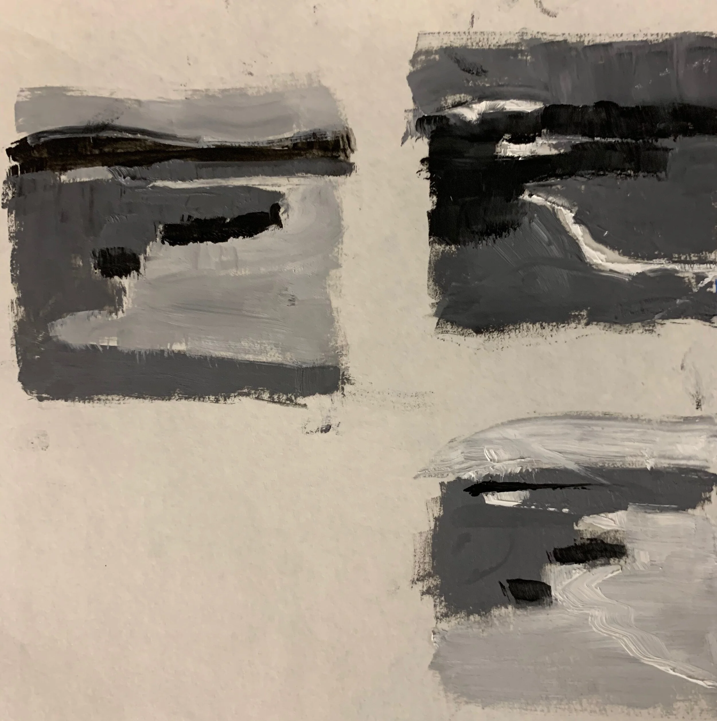
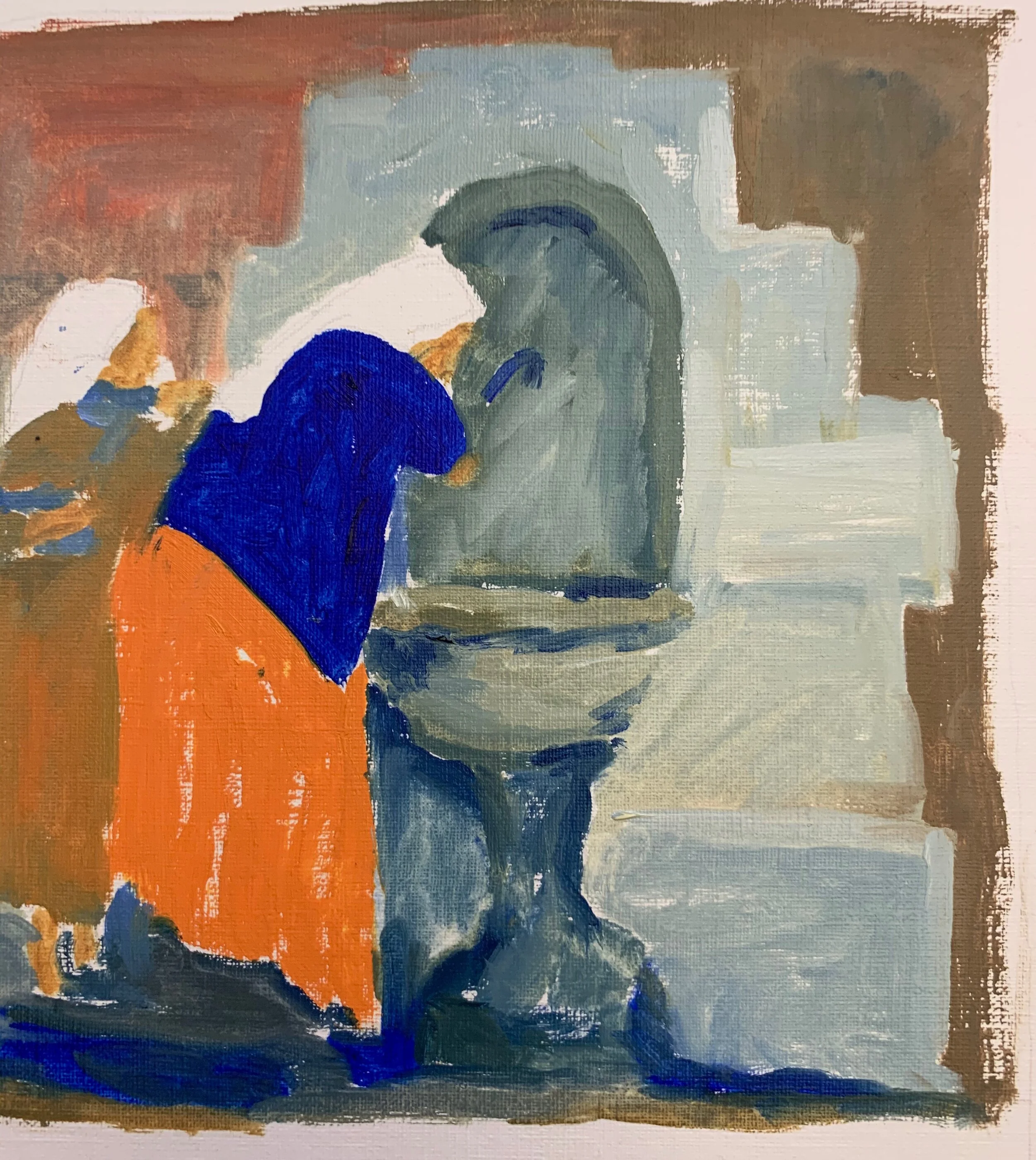
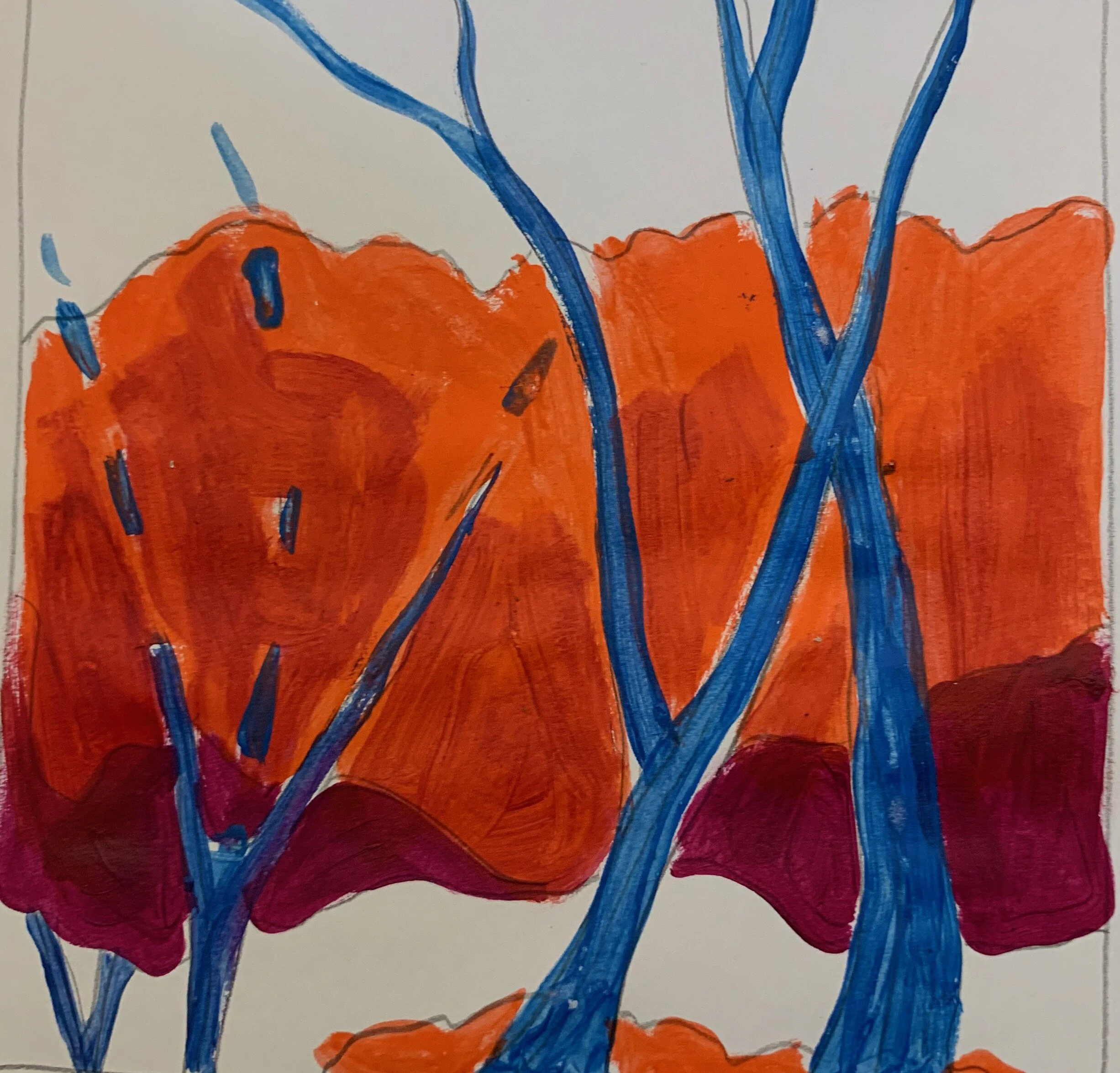
These are three value studies of a grey day landscape.
Which one has the most “punch” or drama?
(We all chose the top right)

IMG_4264.jpeg

Once we did our “plans” we chose one to translate into color.

IMG_4269 (1).jpeg


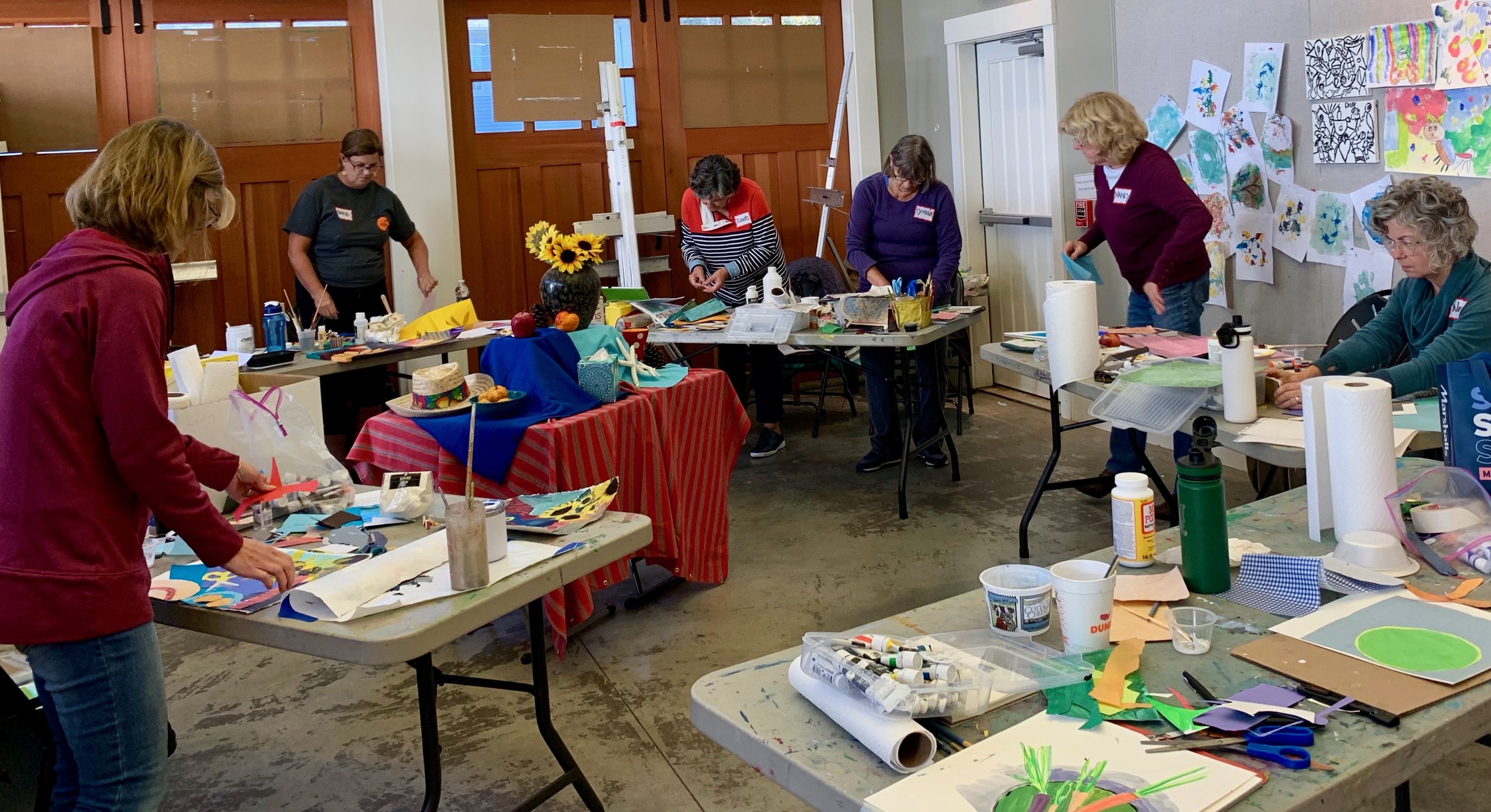
By presenting an idea or challenge each week,
and having them interpret it their own way;
helps us all learn from each other!

Happy Painting everyone!


Back to Oils


Last week I found a stack of square wood panels
(8 x 8, 10 x 10 , 12 x 12)
that I’d toned with bright acrylic colors.
After working with acrylics on paper lately,
I thought it’d be fun to get out the oils and
do some quick simplified architecture pieces.

IMG_4256 (1).jpeg

Lighthouse Road
12 x 12 oil

It was great fun to work with thick, juicy paint again!
(Everything is better with butter)

Then this one evolved after many “scrapes and bruises”
and it’s going to sit for awhile.
I’d forgotten how you can scrape and re-apply paint
using oils on a flat surface!

IMG_4261.jpeg


NOTE:

This was one of the early versions.
Too boring and expected.

IMG_4165.jpeg

Here’s another attempt.
Too many same sized shapes.

IMG_0566.jpeg


Bring on 2020


I set up this winter themed “still life” today
to kick off the new Modern Painting session.

IMG_4188.jpeg

We talked about the idea of designing a composition
using line to move the viewer’s eye.
Some worked from the still life
and some worked from images they chose.

Here’s the quick acrylic sketch I did
from a zoomed in I phone shot.


I had such a great time re-entering the class room,
I forgot to take any images of student work.
Stay tuned because we have a very brave and telented group
and I can’t wait to share.


Artist Interrupted


As much as I love the holidays
they certainly interrupt my “normal” routine.
I got into the studio today
(for what seemed like the first time in weeks)
and started the process of re-entering.

Colella_Nancy_From the 3rd Floor.jpeg

“From the 3rd Floor”
9 x 12 acrylic
I’d started this in early December
and finally got a chance to tweek it today.
(Entry for Small Works at Copley Society are due Jan 1!)

NOTE:
January is a favorite time of the year for me.
I go into hibernation mode;
enjoying long hours in the studio to explore, experiment,
and let the magic happen.

Happy New Year to all.
May 2020 be a filled with lot’s of
new ideas, happy accidents, and
breakthroughs!


Modern Painting


We had our last Modern Painting class at North River Arts this week
and I’m happy to say that this experiemental format worked out well.
Including artists of all levels, working in different mediums;
it became less about “how to paint” and more about
presenting a series of non-representational approaches
(with historical references, contemporary samples)
and letting everyone enterpret their own way.

This week we set up a holiday still life and the idea was to do a
“Pattern Painting” then do a collage from that.

IMG_0547.jpeg

This gal added paper to her painting and created this gem.

IMG_4008.jpeg

Many chose to work from their own images and at their own pace
so the level of creativity and surprise was elevated.
Here are my quick painting/ collage examples done from a black and white image.

IMG_0551.jpeg
IMG_4014.jpeg


The work done in this class was personal and experiemental,
which is the beauty of the class.
We all learn from each other!

IMG_4011.jpeg

Have a wonderful holiday season and
happy painting in 2020!


Same Sized Shapes


I have a habit of making all the shapes
in my paintings the same size
which creates repetitive and boring compositions.

IMG_3807.jpeg

This was the case here, so my solution was
to remove some of the unecessary shapes,
and simplify the values and colors.

IMG_3898.jpeg

I had fun letting this one tell me where to go.
I’m continually fascinated by how
altering the size of a shape or a value,
changes the entire painting.
The challenge continues!


Using Value to Move the Eye


As I continue to work on the “beach house” series
I’ve been exploring the use of value
to move the eye around a painting.
In this painting I wanted the viewer to land on the
door so I gave that area the highest value contrast.
(darkest dark against the lightest light)

IMG_3884.jpeg

Blue Door 10 x 10 acrylic

Below is the original that wasn’t working,
until I realized all the darks areas were competing with each other.
So I lightened the areas where I didn’t want the viewer to stay.

IMG_0543.jpeg

I’ve always been prone to exaggerate my values;
making the darks darker and the lights lighter
throughtout the entire painting.
Now I’m realizing that you can create more interest
( and therefore better paintings)
by controlling where you do that.


Change the Color, Keep the Value


Last week in class, we explored using color as
a compositional element.
while keeping a strong value pattern.
We had some fun doing quick “made up color” notans,

IMG_3817.jpeg
IMG_3831.jpeg

Then we used unexpected or unnatural colors, comparing their values
using black and white photos as a reference.

Here’s my quick demo:

IMG_3825.jpeg

I continually amazed by what this group comes up with.
Here are just a few:

IMG_3835.jpeg
IMG_3836.jpeg
IMG_3818.jpeg
 

Tomorrow we’re going to be exploring shape!

What I'm Working On


I’ve been re-visiting an old favorite subject with a new approach;
focussing on arranging large shapes of value and color

IMG_3805.jpg

I used a quick Procreate sketch I did on my I Pad
for reference.

IMG_0538.jpg

This one has been nothing but trouble.
Too many details.

IMG_3753.jpg

And then there is this first lay in,
playing with arranging shapes without detail.

IMG_3796.jpg

All ok but then I did this.
Over worked and too fussy.
Will keep playing with this.

IMG_3807.jpg

I wasn’t aware that a theme or thread was evolving in the studio
until I put them all together today.
However, I’ve been attracted to “structures in sun light”
since I started painting.
Stay tuned!


Designing with Values


We talked about using value as a compositional tool
in the Modern Painting class this week.
To me, a well designed value plan is the foundation for a strong paintng.
We began by designing two different value plans of a simple subject.

IMG_3742.jpg

Here are two versions a student did from a photo.
The idea is to make value decisions based on what is best for the painting,
not just copy what is in front of you!

Below is the image I used for the “demo” I did
while everyone worked.

IMG_3751.jpg

I chose this value plan to accent the light on the tomatoes,
instead of the back-lit version in the image.

IMG_3743.jpg

And this is how I translated it into color,
comparing the values to the study

IMG_3745.jpg

I was so excited about the work everyone did and regrettably,
I can’t share all the images of the work done. .
This group of diverse and multi-talented artists
are inspiring me to revisit these ideas and approaches
so I’m looking forward to what’s to come!


My Journey Continues


I got inspired to do this after listening to a
a discussion on using “obscuring” in order
to move the eye around a painitng.
I purposefully obscured (or minimized) details of all the parts,
except the pillows
in order to make them the focal point.

Inside Out .jpg

“Inside Out” 12 x 12 acrylic on canvas

I wanted the initial reaction of the viewer to be about the
interaction of the shapes and values,
then allow the actual subject to reveal itself.
These are ideas I’d never considered before
and I’m pretty excited about exploring them further!
Thank you Mark Daniel Nelson.

“People know what a tree looks like.
You don’t have to explain it to them. “
Wolf Kahn


Learning as I Teach


We had the first of six
Modern Painting classes this week.
Fourteen artists at all different levels, working in all different mediums.
Given that, this is structured differently than
any class I’ve taught before.
It’s less about “how to paint” and more about
“thinking” about how to paint.

After introductions and lots of discussion,
we set up a busy still life of random items in the center of the room.

IMG_3676.jpg

We first did thumbnails by zooming in on sections of it,
focussing on simplifying shapes
for good composition.

thumbnails.jpg

The idea was to then use the best thumbnail for inspiration
to make a quick painting.

Here’s a watercolorist’s take;.

watercolor thumbnailsIMG_3684.jpg

Here is how an oil painter approached it;

IMG_3677.jpg

And then there is this acrylic painter!

IMG_3682.jpg

I’m pretty sure there’s going to be some magic happening in this class!
The opportunities are endless.
Will keep you posted.


Collage Self Portraits


For the last session of the fall COLLAGE class at
Linden Ponds this week we did self portraits.
This is such a fun project to do with anyone, any age
and the results are always unexpected.
Here are just a few of the fun creations from our talented group!

IMG_3553.jpg
IMG_3555.jpg
IMG_3559.jpg
IMG_3561.jpg
IMG_3560.jpg
IMG_3558.jpg
 

It’s such fun to see how others see themselves.
I will miss working with this brave and talented group!


Modern Painting


I’m excited to be teaching a new 6 week class
called “Modern Painting”
at North River Arts
Tuesdays Nov 12 - Dec 17.

“Mid Century Modern” 10 x 10 oil. (Sold at an “Out of the Box” show including work done “not in your usual style”)

“Mid Century Modern” 10 x 10 oil. (Sold at an “Out of the Box” show including work done “not in your usual style”)

(“Modern Painting” just means non-traditional or representational)
If you are feeling “stuck” or uninspired,
this could be just what you need! .

 “This class is designed for the artist who is interested
in exploring ways to create more modern, bold, 
and expressive paintings
by taking a less representational approach. 
While retaining a bit of reality, we’ll explore ways to manipulate the abstract elements of line, shape, color and value to express an unexpected idea or statement.
Through a series of quick, fun exercises, we’ll learn how to
“change the rules” and let our intuition guide us.
We’ll be working from still life and/or photos.
All painting mediums are welcome.”


Blog as a Diary


I’ve always used this blog as a diary of my artistic journey
and lately I have nothing to post about my “works in progress”.
So here’s a peek of what I do when I’m not at the easel.

Hibernation.jpg

Prepping for the Copley Society Winter Members Show.
Winter themed shows are always a challenge
so I’ve been re-working this favorite from a few years ago.

Needs a title!

Guest House.jpg

We stayed at a friend’s lovely guest cottage in Charleton SC
last week, so I did this small painting as a gift for them.

IMG_3459.jpg

My favorite Tuesday morning collage class at Linden Ponds.
High point of my week.

Being an artist is so much more
than what you accomplish at the easel.

I’ve been given so many opportunities to share my journey
and for that,
I am very grateful.


Forest Bathing


I was recently introduced to
Shinrin-yoku a term that means
"taking in the forest atmosphere"
or "forest bathing."
It was developed in Japan during the 1980s
and has become a cornerstone of preventive health care
and healing in Japanese medicine.
It was a lovely afternoon
and we all felt very connected to the woods.
(and fortunate that we get to do it so often!)

IMG_3315.jpg

“Forest Bathing”
20 x 16


I was inspired to paint this from memory the next day.
This is one of those paintings that I‘m afraid to touch.
It says everything I needed to say at that moment,
so why confuse things?


Life Long Learning


I’m happily back teaching a collage class
as part of the Life Long Learning program at Linden Ponds.
Yesterday we did simple abstracts using 5 different colored papers
cut into 5 different shape; then arranged.

Here are just a few of the fun results.

IMG_3287.jpg
IMG_3290.jpg
IMG_3293.jpg
IMG_3291.jpg

It is truly wonderful to spend time with these
entusiastic and charming residents.
Next week we’ll be doing landscapes!


Why I Teach


We had a wonderful day playing with paint, cut paper, and glue
on Saturday at the North River Arts Society.
Nine brave artists pretending they were in
pre-school.
Here are some of the collage results.
The idea was to organize the shapes and colors
in a pleasing arrangement.

IMG_3198.jpg
IMG_3203.jpg
IMG_3193.jpg
IMG_3189.jpg


To me, there is nothing more fun than making art
in a room with other artists.
The sharing of different experiences, ideas, and approaches
is so fullfilling and truly inspiring.

 
IMG_3187.jpg


Using Collage to Simplify Paintings


In preparation for the one day workshop this Saturday,
I’m still playing around with using collage
as a means to simplify paintings.
Here is my process:
First I set up a simple still life.

IMG_3104.jpg

Then I did a quick gouache sketch of it.

IMG_3107.jpg

Using the painitng as a reference, I then did this collage.

IMG_3111.jpg

Below is the quick painting I did using
the gouache and the collage as a reference.

IMG_3146.jpg

I allowed this last one to get too literal and tight.
I’m still fnding the initial sketch and/or the collage more exciting than the final piece.
I think I’m over thinking this whole thing.


MIA


I’ve been missing in action while I transition from summer to fall.
A change in the seasons always interupts my focus and work flow.
Yesterday I finally got around to doing the painting
from the collage I did last month.
(see previous post)

Jayne's Koi Pond.jpg

Jayne’s Koi Pond
10 x 10 oil on board

Admittedly, I did not use the collage as a reference
as it was too confusing!
I ended up referring to the original image.
I do think that doing the collage informed my paint application and
simplification of shapes.
I tried to keep the details to mere suggestions.

I’m re-thinking the plan for the one day workshop
I’m teaching at NRAS on Oct 5.

NEWS:

I’m pleased to say that the painting below
won an honorable mention last week
at the NRAS Members Show!

Hot Sunday .jpg


”Hot Sunday”
20 x 20 oil