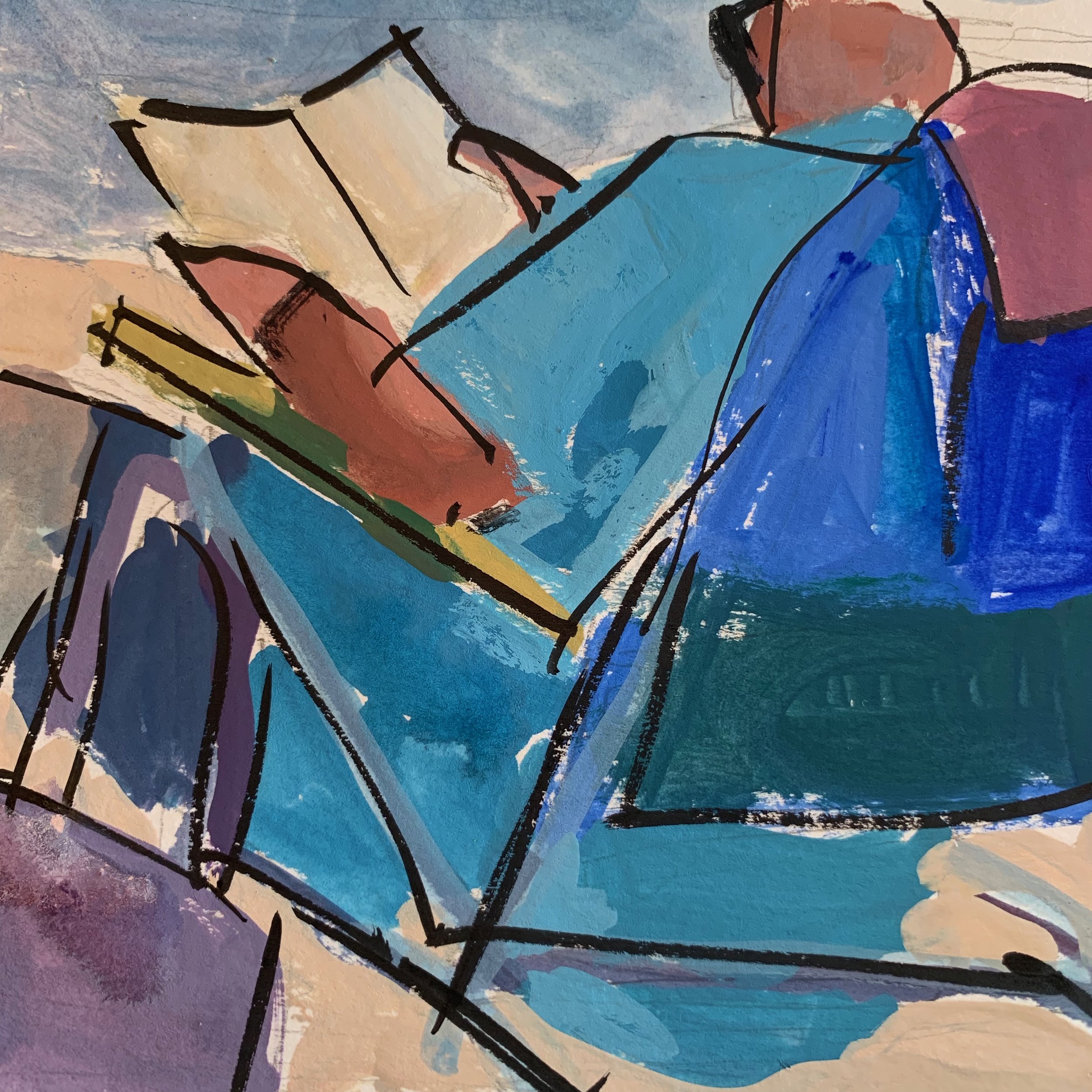
Having fun doing these quick gouache
studies at the beach.
“Serious Beach Chat”
10 x 10 gouache
brush pen
Day Off
10 x 10 gouache
brush pen
Trying to focus on taking a bit of reality
and making it about the shapes.
Having fun doing these quick gouache
studies at the beach.

“Serious Beach Chat”
10 x 10 gouache
brush pen

Day Off
10 x 10 gouache
brush pen
Trying to focus on taking a bit of reality
and making it about the shapes.
Every seasonal transiton upsets my painting rythum.
Since moving to the beach in early June
I’ve had limited time and space to do any serious painting,
so I’m trying to squeeze in quick gouach sketches,
to use as studies for larger studio paintings….
when the dust settles .

I have to remind myself that it’s ok to take a break
a few times a year.
Time with friends and family and just living life fully
gives us fresh eyes and new subject matter!
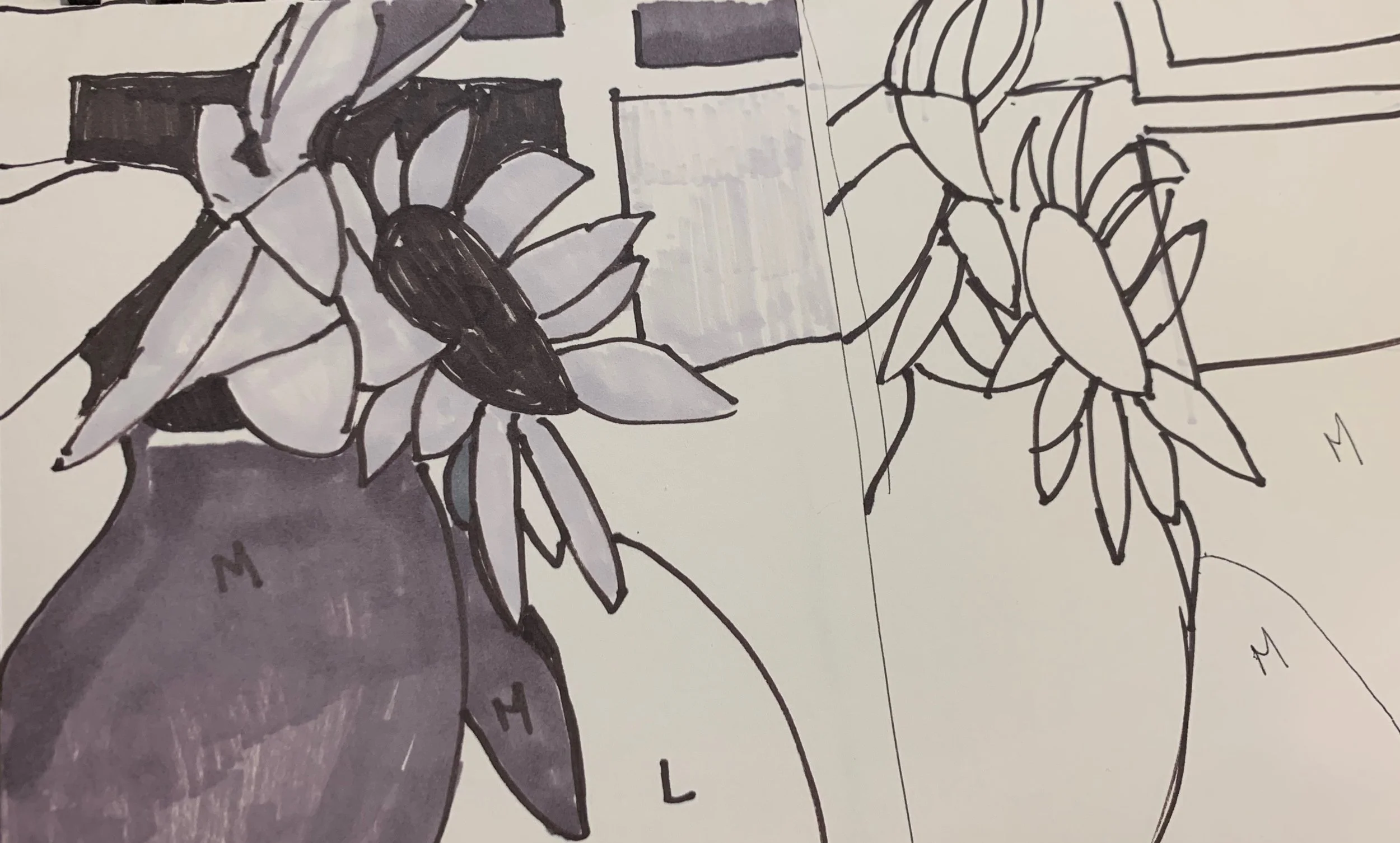
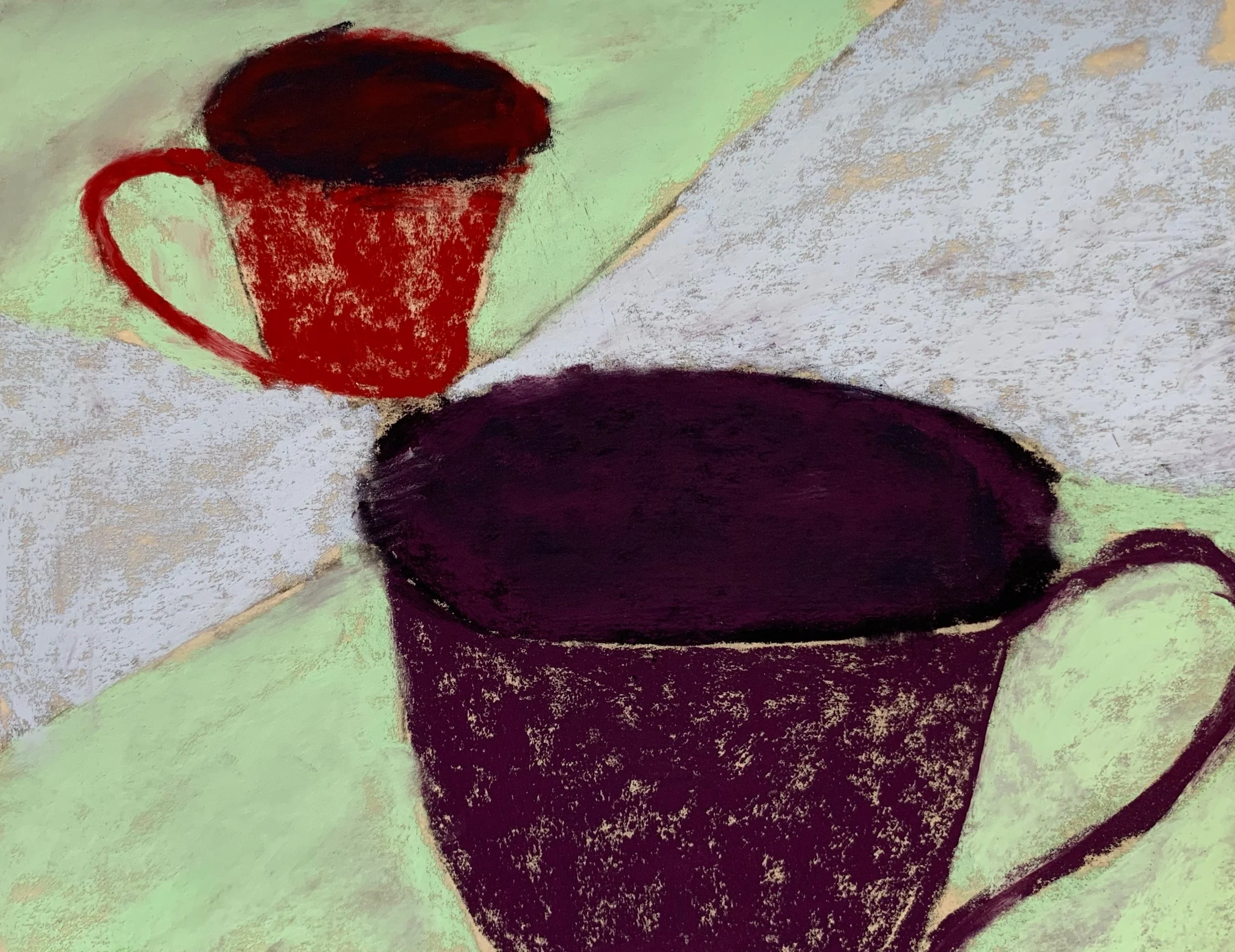
Sometimes the simplest subjects make
dynamic compositions.

“Yellow Cup”
12 x 12 gouache on paper
I don’t seem to have the time lately for long painting sessions
so it’s fun to do these quick gouache studies when I can.
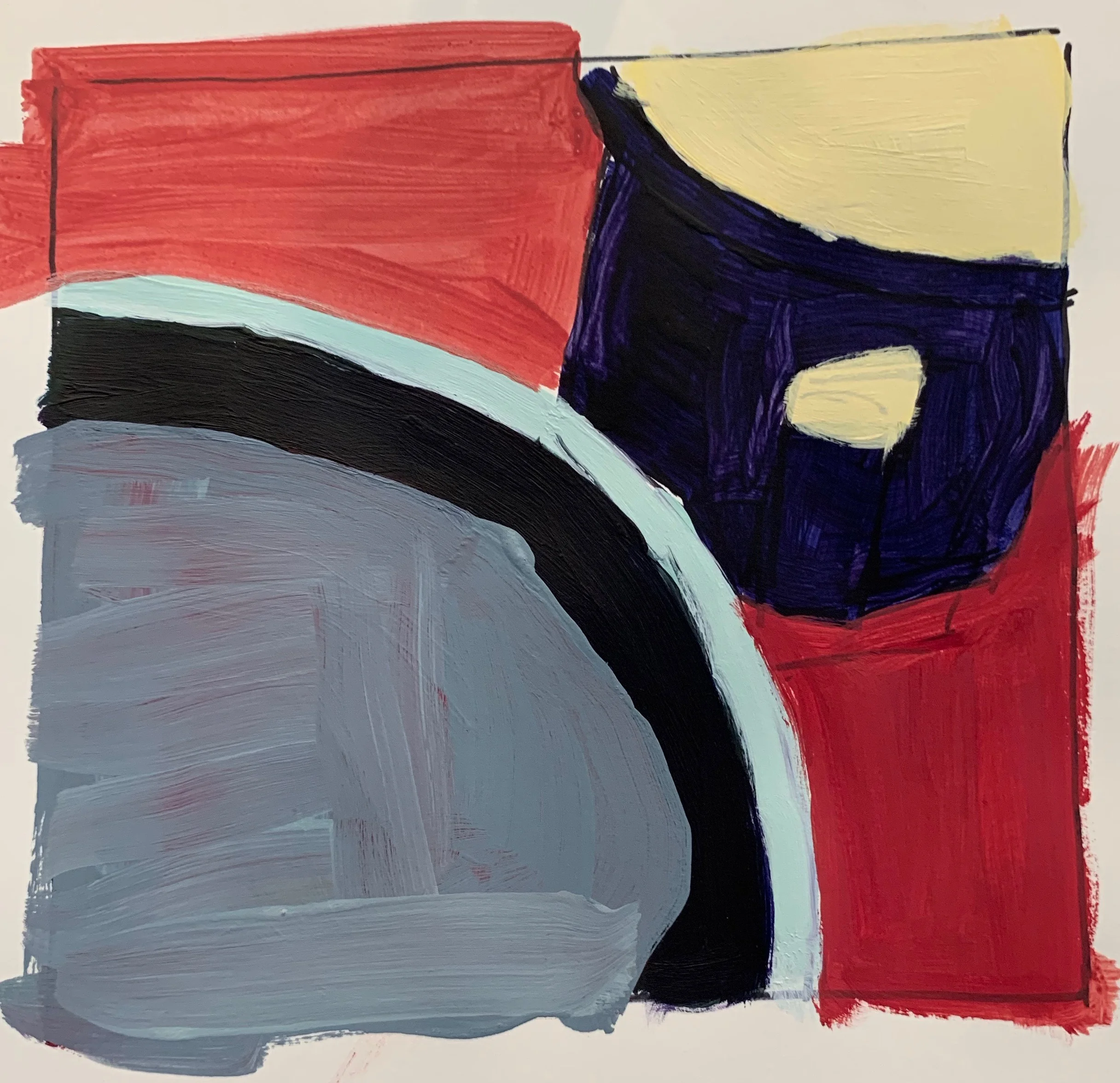
Summer is finally here!
This week in class, we were talking about how value
can change the entire mood or feel of a painting.
This painting has been in the works for while,
so I used it to experiment.

Duned Inn 18 x 18 oil
The intitial idea was about the many houses on our coast
that are getting buried by rising sand dunes;
becoming “duned in” instead of “snowed in”.
I’d darkened the sky to make the sand dune more prominate.
When I put it into Procreate and adjusted the values
of the sky, house and sand;
each one tells a different story!


Using Procreate is a very helpful tool when
planning and changing paintings in progress.
I highly reccomend it.
It’s so fun to have such terrific subject matter
right outside my door these days.
This is an all time favorite.
These men can do this for hours on end…..
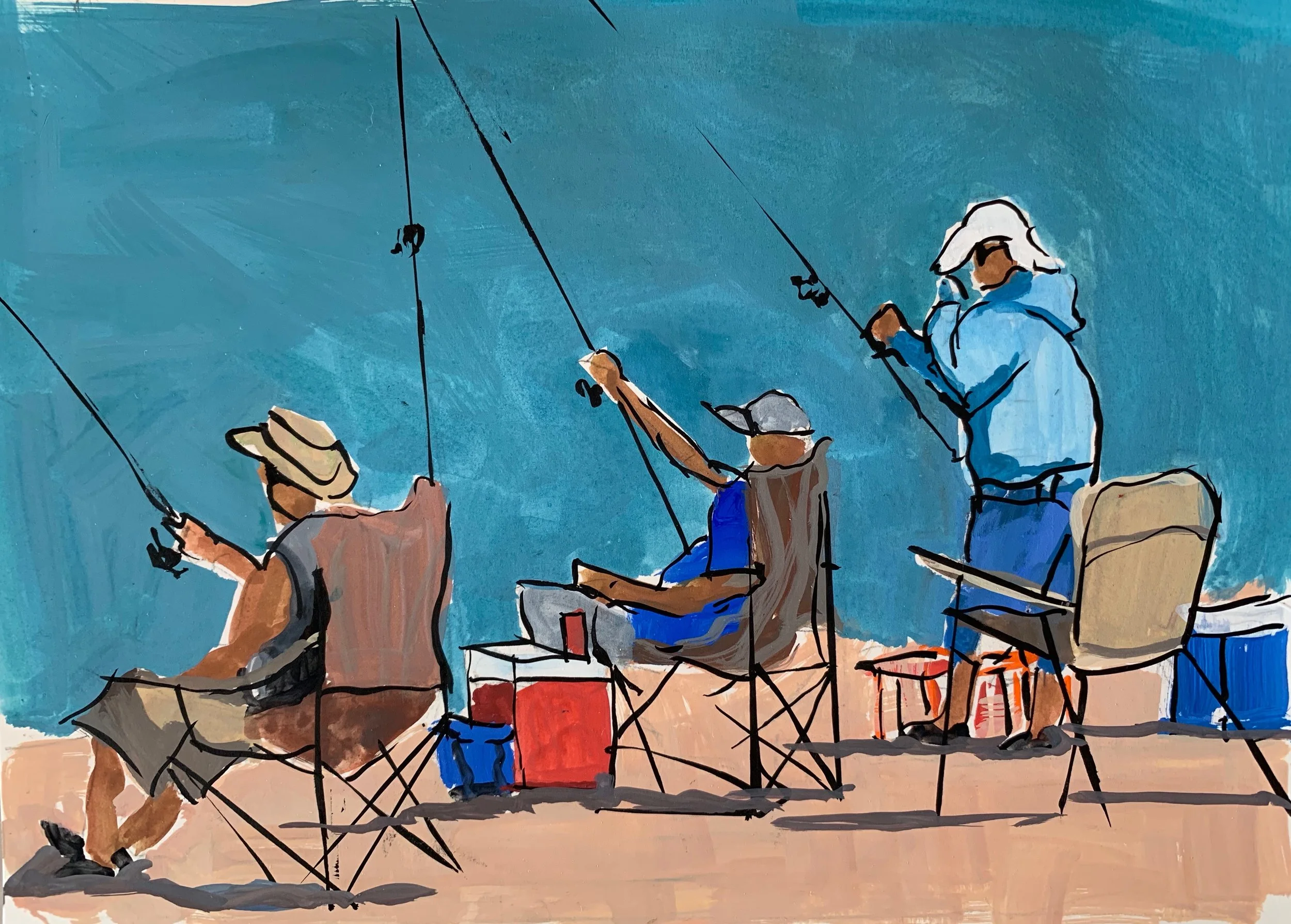
”Surf Casters” 9 x 12 gouache on paper
Playing with gouache and an ink pen
until I bring over my full painting gear.
Happy Father’s Day Weekend!
As the summer routine begins to take shape,
I’m inspired by new surroundings and getting some time to just play with paint!
Today I used a gessoed wood panel with oils,
very thin paint
and held my brush differently.
(using my wrist instead of my fingers)

Orange Throw 12 x 12 oil on board (Work in Progress)
Here’s how it went;
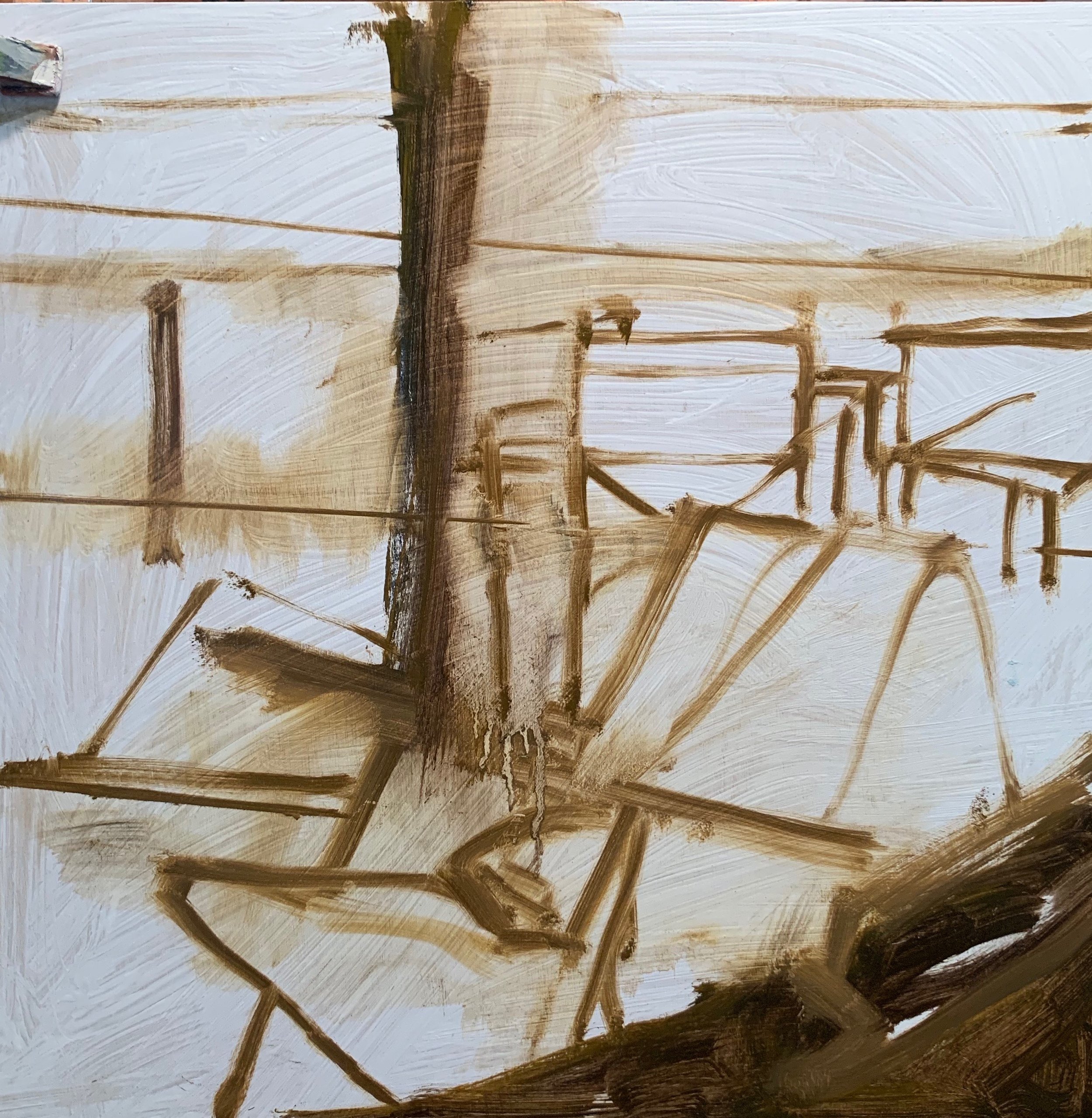
The block-in using my new favorite color: asphaltum
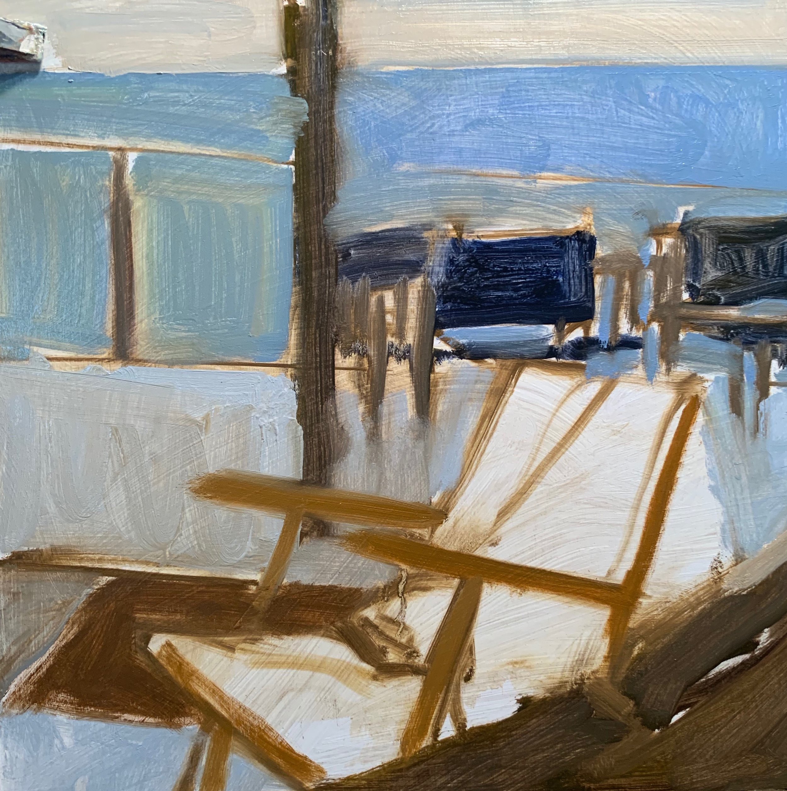
Adding one color note at a time.

Ug oh! Too many colors. And so it goes….
We’ll see where this takes me.
I’m channeling a bit of Diebenkorn
here, I think.
Go Bruins.
Summer is ramping up and the weather if finally starting to cooperate.
The Rosa Rugosa is in full bloom at the beach now
and the fragrance is out of this world.

My mother-in-law Rose planted these in the 60’s.

“Pink Cottage” 6 x 11 gouache
This iconic little beach cottage gets re-painted
a brighter pink every year and it looks stunning
amidst all of the
Rosa Rugosa surrounding it.
NOTE:
So far, I’ve only managed to bring my my gouache set to the beach
and plan on bringing over a full blown kit of supplies next week.
Let the summer begin!
I’ve been busy transitioning from winter to spring/summer,
so I’ve been a bit MIA in the painting department.
The change of weather and all that that brings;
gardening, house projects, celebrations,
and travelling have kept me pre-occupied.


New subject matter is popping up everywhere,
and I’m looking forward to the dust settling
so I can get to work!
Happy Spring/Summer
This painting has endured
many versions of itself.

“Lap Nap”
16 x 16 oil
The initial idea was to capture the essence of
my good friend and her pup.

Right off, I struggled with her face and the pup competing for attention.
After many attempts to pull it together
I switched gears and decided to crop it,
making it less a portrait,
and more an abstract expression.
I’m learning to let go of my initial idea
and let the painting evolve as needed.
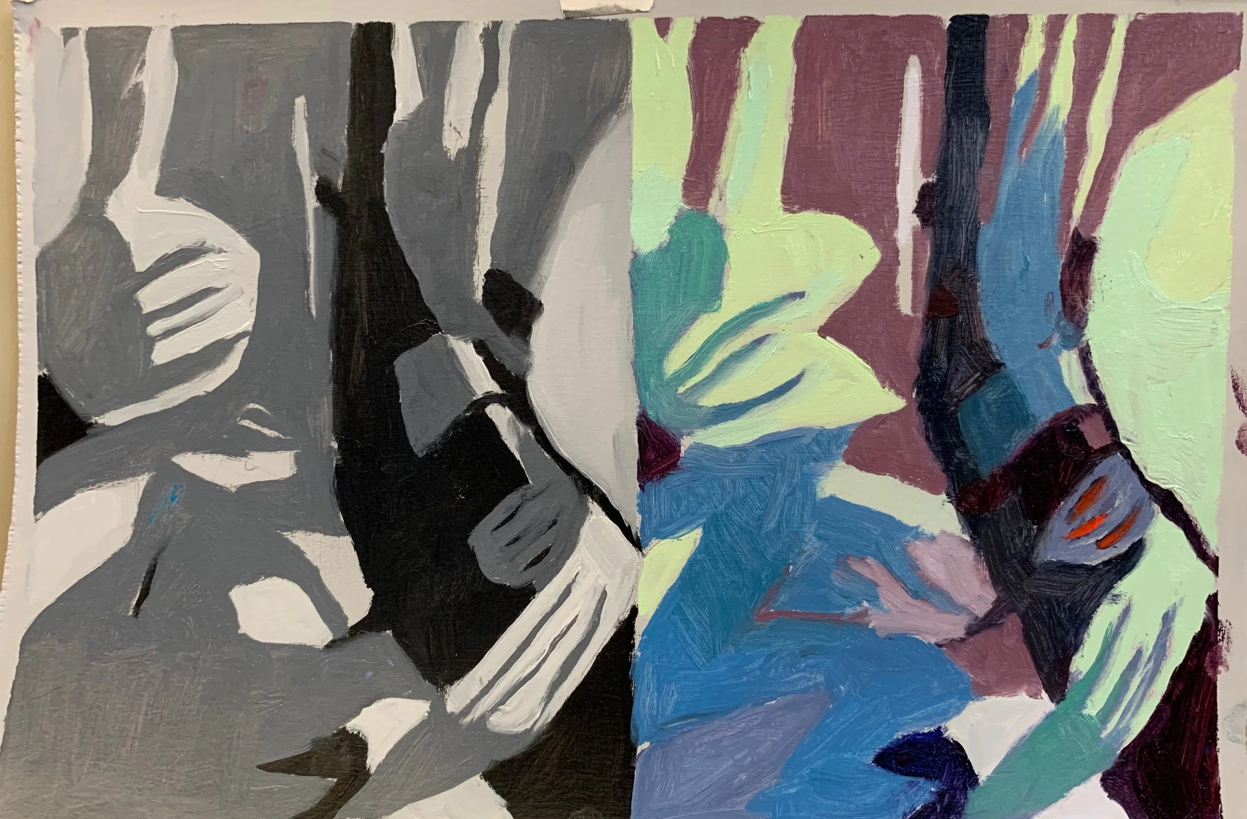
Many of the new artists I’ve been discovering lately
paint very intuitively;
applying paint freely, then scrapping and re-applying.
I watched a demo of Martin Campos painting the figure today
and got inspired to try it.
I did this in oil over the acrylic block in below.

In both I used a limited pallet
(a blue, red, yellow black and white)
and tried not to get too hung up on the subject or drawing.
I applied the paint loosely and did a lot of scraping.

For me, this is a very sophisticated and fascinating way to paint.
No guidelines; just you and the paint.
NOTE:
I’ve wanted to paint the figure for a while now
but haven’t had a model, so I used this still shot
I took from a scene in
Bohemiam Rhapsody

Spring is popping up all over New England.
Every day, I notice new blooms and colors
on my walks in the woods.

Fiddle Heads
14 x 11 acrylic
I am always intrigued by how these ferns
magically “ unfurl” every spring.
ENJOY!
We talked alot about the thinking
that “to make a painting better,
it needs to be more real.”
We focussed on manipulating the four elements of design;
Line, Shape, Color, and Texture
to design our paintings,
instead of just copying what is in front of us.
In the morning we worked from a busy still life
and began by doing zoomed in thumbnails.
(line)

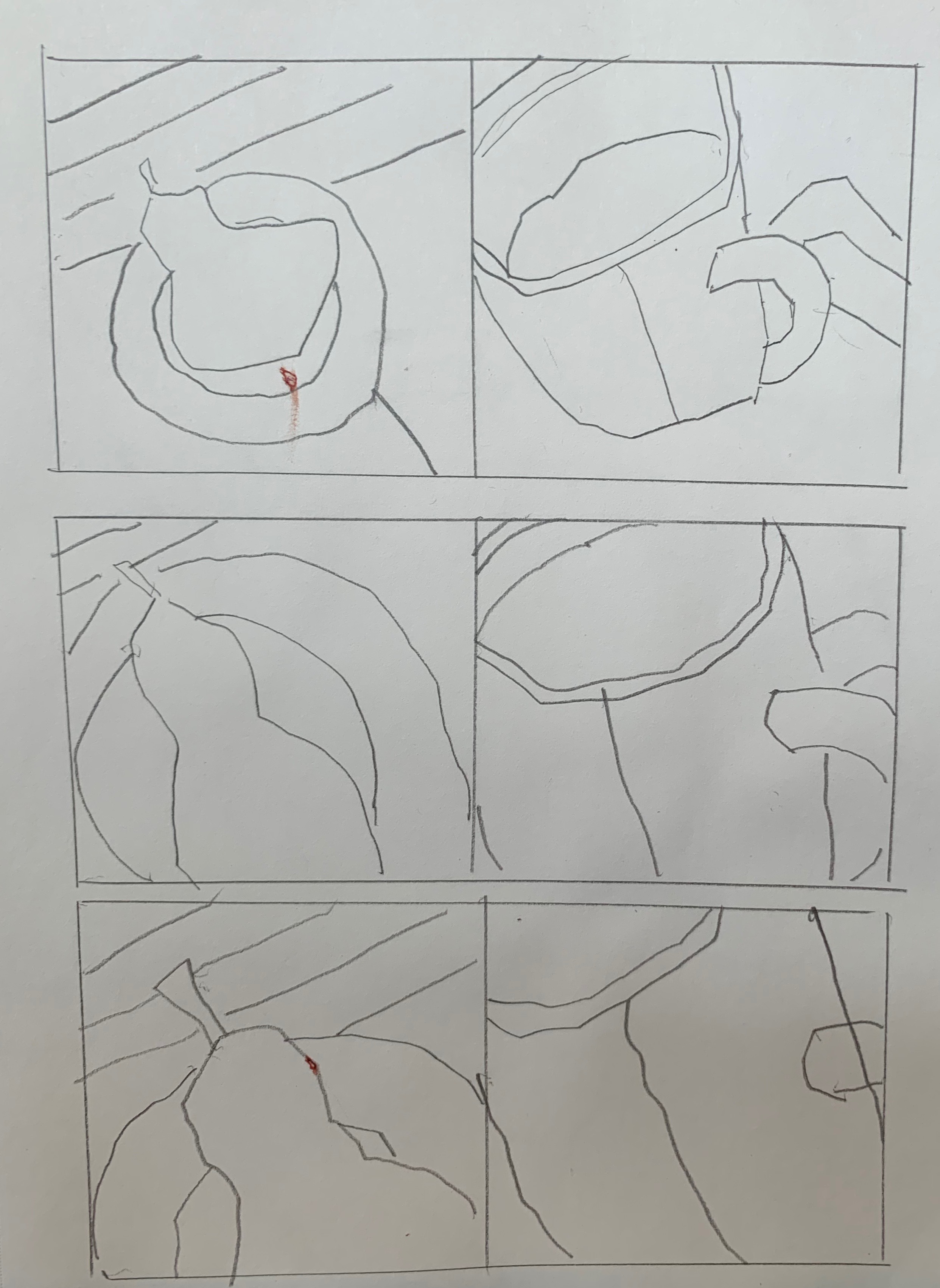
From those, we chose our favorite and designed
two different value studies using only three values.
(shape)
Then we added “made up” color,
matching the value plan in our design.
(Color)
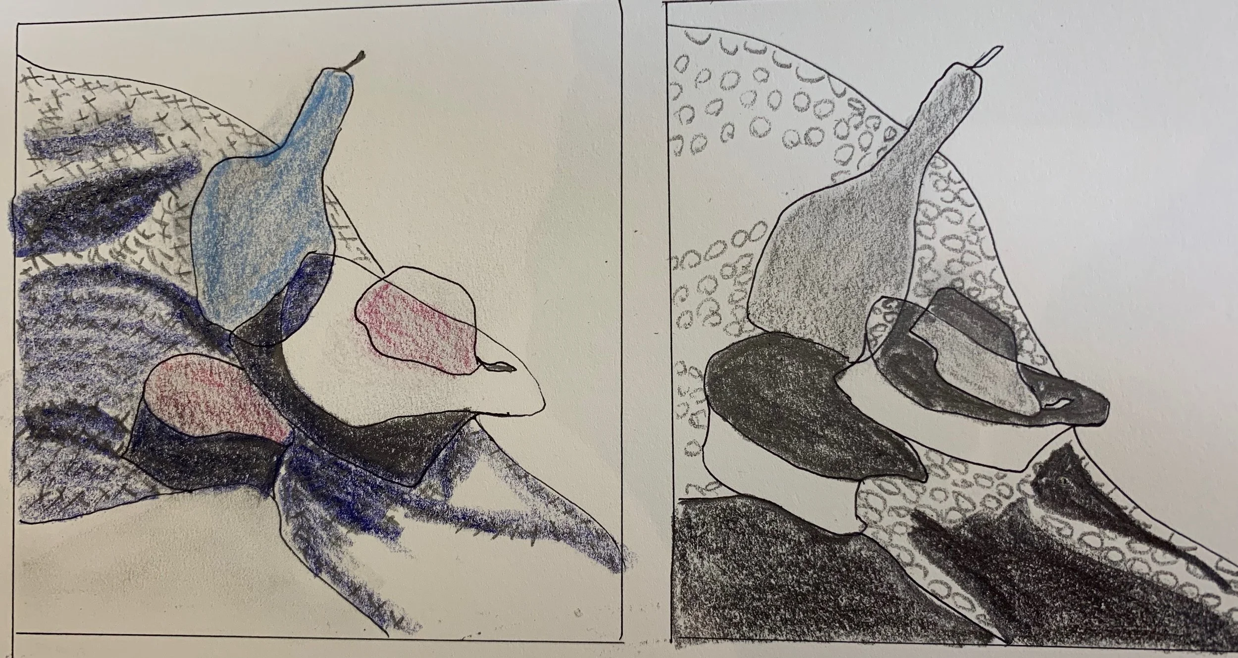
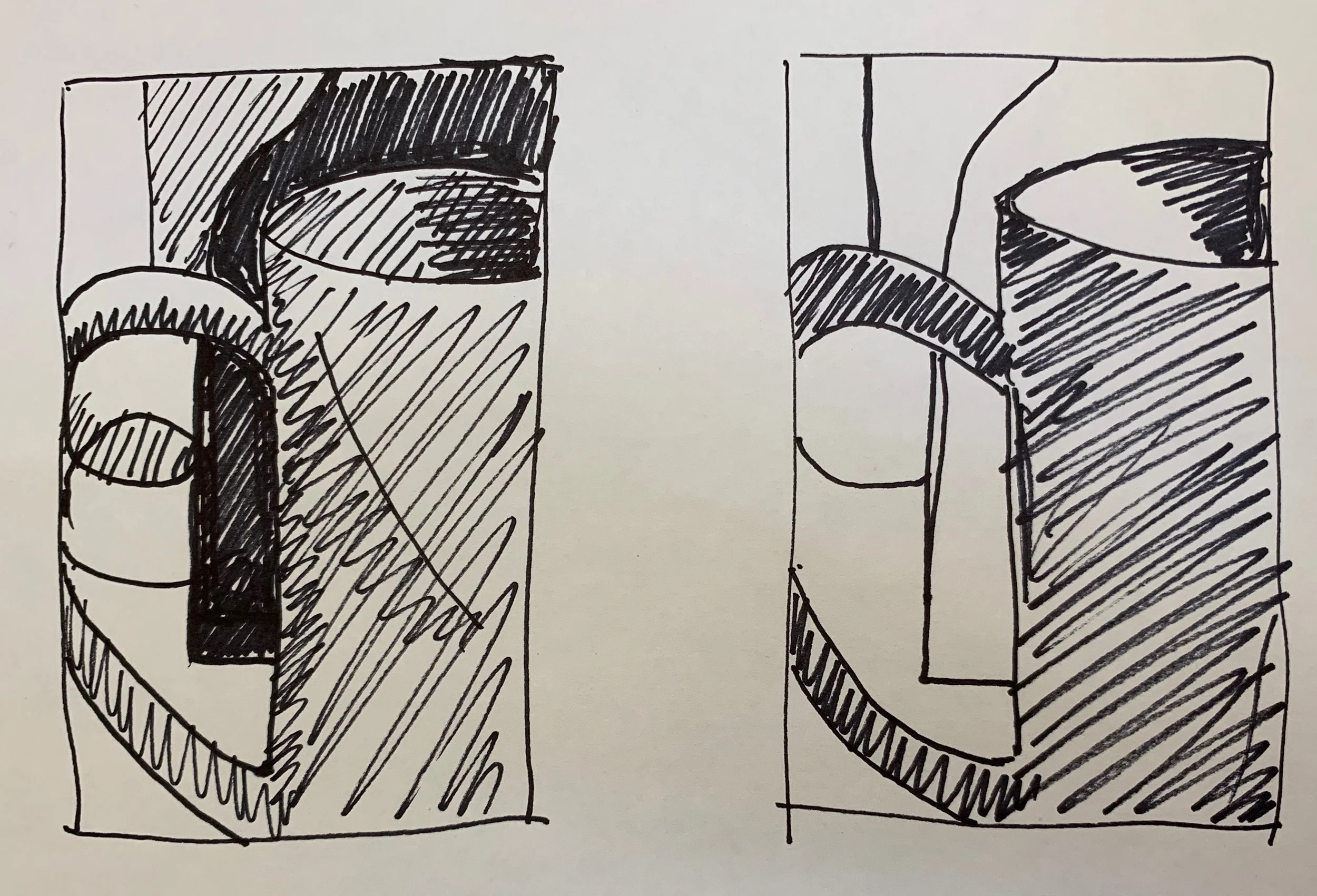
In the afternoon we painted from upside down
black and white images, using a limited color range.
(Color)
Then we painted over an old painting,
manipulating the surface with knifes, scrapers,
chacoal etc.
(Edges/Surface)
We packed a lot in to one day, and only scratched the surface of ways to push our paintings beyond the expected.
More to come.
NOTE:
This was an open medium class and we had
6 pastel painters, 1 watercolorist,
1 oil stick, 2 acrylic, and 1 oil painters.
Interesting to see the exercises
translated to these mediums!
Great work everyone.
As the world begins to wake up from the long winter,
I'm already thinking about the beach.
I arranged this from a few different images taken last season.

”Vitamen Sea”
16 x 16 acrylic on paper
Not sure what it is about using acrylics on Canva paper,
but I’m finding it very freeing and fun.
I’m teaching a one day workshop this weekend
at North River Arts
”Breaking the Literal Habit”.
Many artists reach a point when they
want to go beyond painting what’s in front of them.
We’ll be exploring ways to use the elements of design;
line, shape, color and surface to make
more expressive, personal paintings.

Orange Sky
8 x 8
For the “making up color” exercise,
we’ll be using upside down black and white images
as a reference.
Can’t wait to see the results.
I recently did a series of small studies exploring
new ways of depicting
an old favorite subject;
Beach cottages.

“Orange Sky”
8 x 8 oil on paper
I’m preparing for my one day workshop
”Breaking the Literal Habit”
coming up April 27 at the
North River Arts Society.
NOTE:
That house was NOT “literally”
yellow and purple.
Again, I’m thinking about how to arrange
shapes of color in compelling ways.
Here, I used the pink chair to
bring the viewer in toward the focal point;
the figure and red bathing suit.
(A work in progress)
I’m experimenting with ways to create more
personal and expressive compositions,
without merely copying what is in front of me.
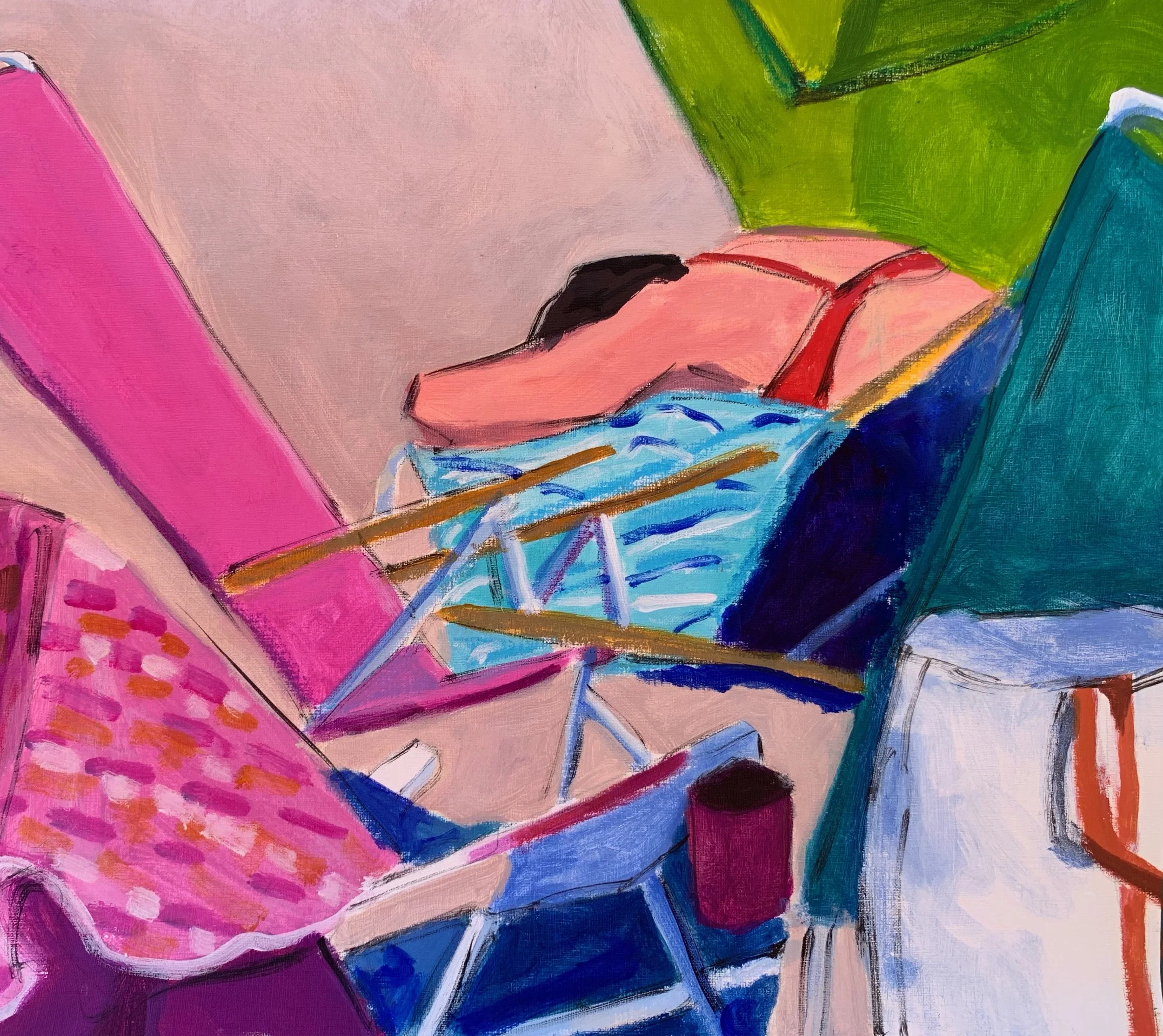
“Alone at Last”
16 x 18 acrylic
(Work in Progres)
This is all in preparation for the one day workshop;
“Breaking the Literal Habit”
I’m teaching at North River Arts on April 27.
NO MORE COPYING!
I was struck by this scene at a friend’s house last week
and immediately noticed the
subtle repetitive shapes.
This is a design concept that I’ve recently been introduced to;
never considered before,
and am now acutely aware of!


”Cat Heaven”
20 x 16 acrylic
NOTE:
I was happy to donate this to the
Hull Seaside Animal Rescue
20th Anniversary Fundraiser
South Shore Art Center
April 26th 7-9.
One of my pals is an avid cat lover
and a dedicated volunteer there.
After these many months of the darkness and cold,
I’ve been yearning for some color and warmth.
I went to my “Images to Paint” file and put this composition together,
using a few different photos.

“Thinking Summer”
14 x 18
A decidedly looser approach for me;
even I was surprised.
Happy Spring!
This week we did self portrait collages in the
mixed media class I teach to residents at
Linden Ponds,
a local Independent Living facility.
I thought I’d share a few of the surprising results.

This woman just returned from the Caribbean
where she did a lot of snorkeling.

This woman enjoys music, reading, and gardening.
And she told me her hair is “every color under the sun. “

This was so carefully and beautifully executed.
Those are her eyes!

This one is 3- D!

David told me he “had a ball”doing this.
And that’s all that matters.
ENJOY!
When my friend told me about her Grandaughter
shopping for her first prom dress,
I asked if she had images.
I’ve been looking for figurative subjects
and am experimenting with texture
so this was just perfect!

First Prom Dress
20 x 16 acrylic and oil stick
That fabric!
I lightly applied a little red oil stick
and then rubbed it in
to get the see- through affect.
Using thinner paint on canva paper
is all new to me and I’m excited.
I